OxyGen — identity for the steel company
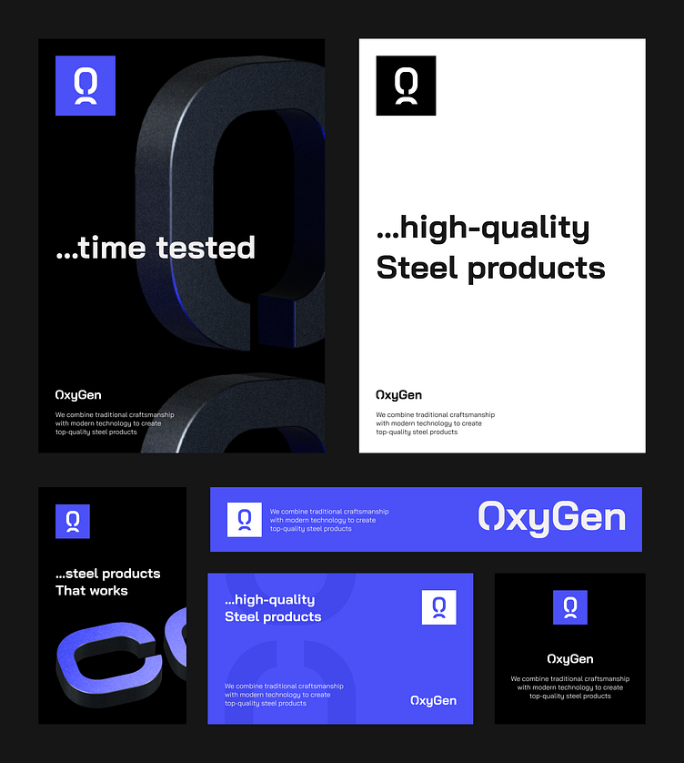
In my design project for OxyGen, I've harnessed the power of visual storytelling. The striking logo incorporates the 'O' and a section of the 'G' from the company name, ingeniously forming a metaphorical depiction of metal chain links, symbolizing the company's unwavering commitment to crafting customized steel products for their discerning clientele.
To elevate the visual impact, I've integrated 3D graphics, introducing an aluminum texture that transcends the mundane visuals commonly employed by competitors. This adds a tactile quality to the imagery, underscoring OxyGen's dedication to precision and excellence in their manufacturing processes.
As an exclamation point, I've introduced a vibrant bright blue hue, which not only complements the company's branding but also serves as an accent to emphasize OxyGen's adoption of state-of-the-art technology. This distinct visual identity communicates that, at OxyGen, the fusion of modern innovation and steel craftsmanship is at the heart of what they do.
The result is a design that epitomizes OxyGen's uniqueness, effectively conveying their core values, dedication to custom solutions, and the power of modern technology in crafting exceptional steel products for their clients.
