Flixr - Streaming App


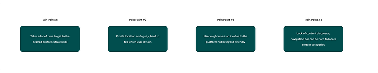
❗Problem
Younger users, aged as early as 4, encounter difficulties when attempting to switch from their parents' profiles to their own on their streaming platform. The current user experience involves a cumbersome process requiring approximately 10-12 steps to access. This hinders young users' ability to access their family-friendly content efficiently and creates a frustrating experience for both children and parents.
📍Goal
The goal is to optimize the transition process between profiles for younger users to ensure a seamless and child-friendly experience. By simplifying and enhancing the profile switch mechanism, we aim to improve the overall user experience and make it more intuitive for children to access their personalized content.
💡Solution
Introducing Flixr!
Flixr is designed to provide the user seamless and more efficient experience. This desktop application makes your communication flow so much more efficient and seamless for your small business and much more!
🗣 My Role & Responsibilities
Using Figma as a UX/UI designer, I was responsible for conducting user research, market research, creating user flows, wireframes and prototyping, while thinking of the user’s experience and user’s interactions.
📝User Research
I conducted research through interviews of friends and family. Throughout this research, I found that all younger children (aged 4-8) typically get annoyed if they are not in their profile within 4-5 clicks. If the user interface is not kid-friendly, then there are higher chances of the parent unsubscribing from the streaming platform.
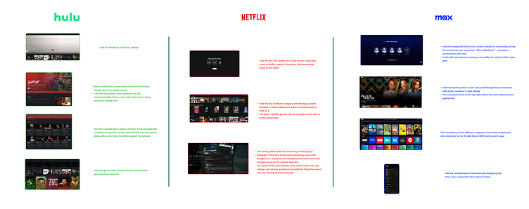
📝Market Research
I took a good look at other competitors, such as Hulu, Netflix and HBO MAX.
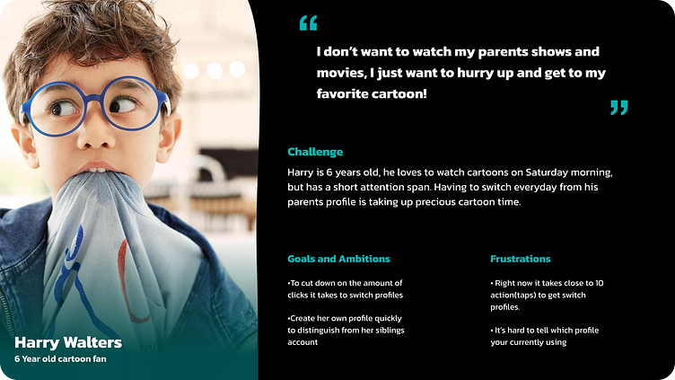
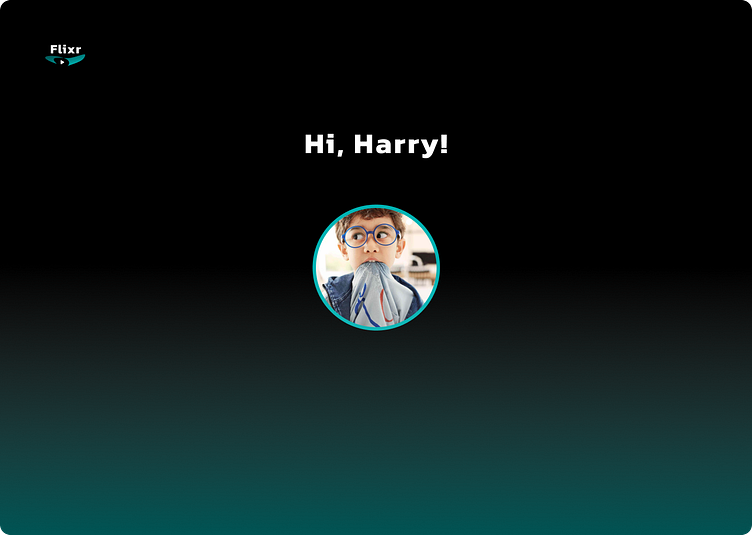
👤User Persona
Meet Harry Walters, a young child who loves to spend his time on the weekend watching his favorite TV shows and movies.
🔁User Flow
Based on the analysis from both user and market research, I developed a user flow that shows the easy & efficient flow of switching profiles under 6 clicks.

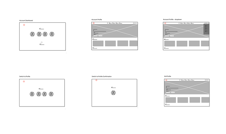
🛠️Wireframes
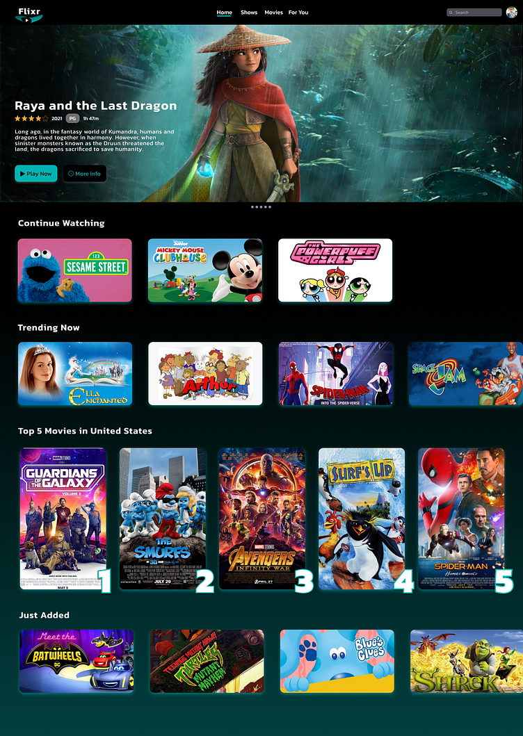
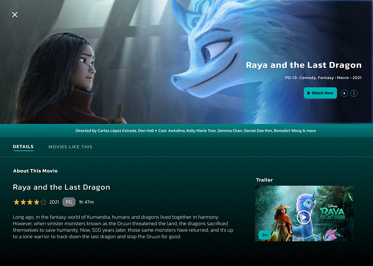
Creating low-fidelity and high-fidelity wireframes helped lay out the formats into perspective. I decided to go with a simpler and kid-friendly design, where everything is “right there”.
Low Fidelity
High Fidelity

🎨Visual Design
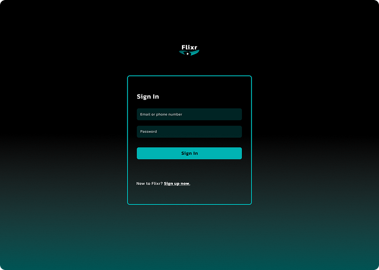
Ultimately, I decided to design a layout where that was extremely user-friendly; making sure to easily navigate where to switch accounts and a gradient dark background without any distractions.


UI Library


🖥️Prototype
✅Takeaways
Designing a streaming service was exciting! Throughout this process, I had the opportunity to understand the user’s needs and requirements and develop an intuitive desktop application for younger kids. Initially, it was a little tricky to make it look very basic and like any other streaming service platform. However, with my creative freedom, I combined the obvious elements/components with minimalism.
The main goal was to enable users (young kids) to switch from their parents’ profiles to their own under 6 clicks.
Thank you for taking the time to look at my case study!
Please don't hesitate to reach out for comments or questions - would love to connect!