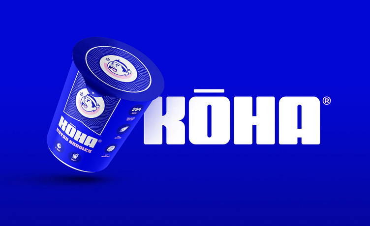
Kōha Type Experiment
Kōha Identity (FT-Ex-14)
This typographic treatment and logo were inspired by Japanese food packaging. In Japanese, the name Kōha refers to people who are "hard", "strong," or "tough", and is named after the angry Kōha Chef logomark mascot.
Part of the Further Type Experiments (FT-Ex) series.
The super-heavy Kōha logotype lettering embodies strength and toughness.
More by Further Type Foundry View profile
Like


