IKAPE - Logo Redesign
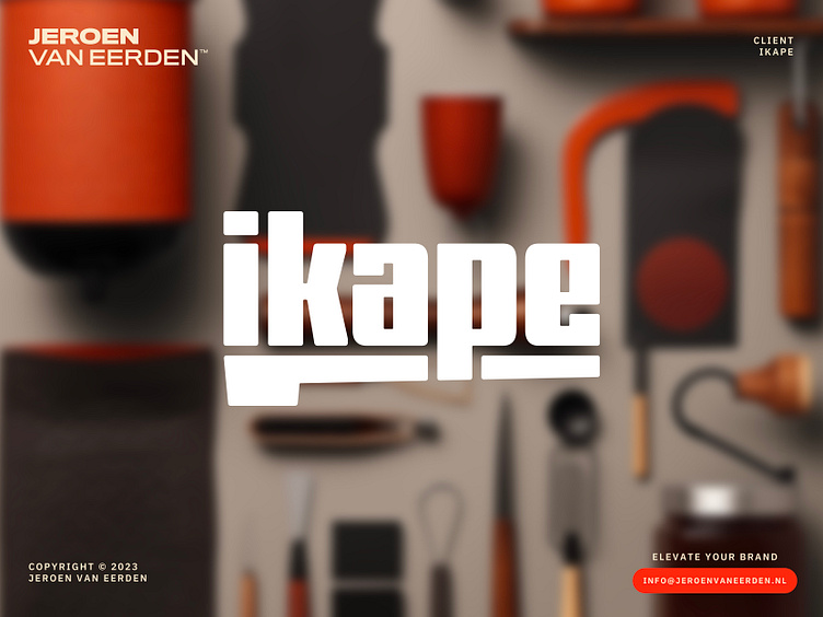
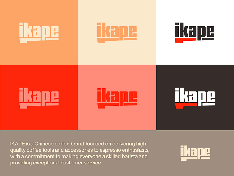
IKAPE is a Chinese coffee brand focused on delivering high-quality coffee tools and accessories to espresso enthusiasts, with a commitment to making everyone a skilled barista and providing exceptional customer service.
Part of the series where I work on personal projects in a niche I’m passionate about, as a semi-professional home barista myself.
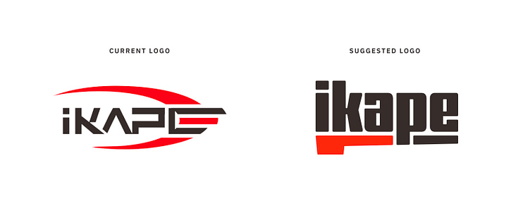
Concept
The idea of this concept was to capture a portafilter within the actual logo word mark. This element captures a wide range of barista-quality materials and embrace the professional part of their industry.
Feedback
What do you think of this logo redesign? Currently open for feedback.

[email protected]
🚀
Let's work together and elevate your brand!
Feel free to reach out via Dribbble DM or E-mail.
💼 Connect with me on LinkedIn / Read my Client Recommendations
🎬 Check my YouTube for Logo Tutorials / Learn Logo Design
🔗 Follow me on Instagram / See BTS and New Content
🛒 Buy my pre-made or unused logos from the portfolio
💬 Tweet with me
