BPI — Landing Page Concept
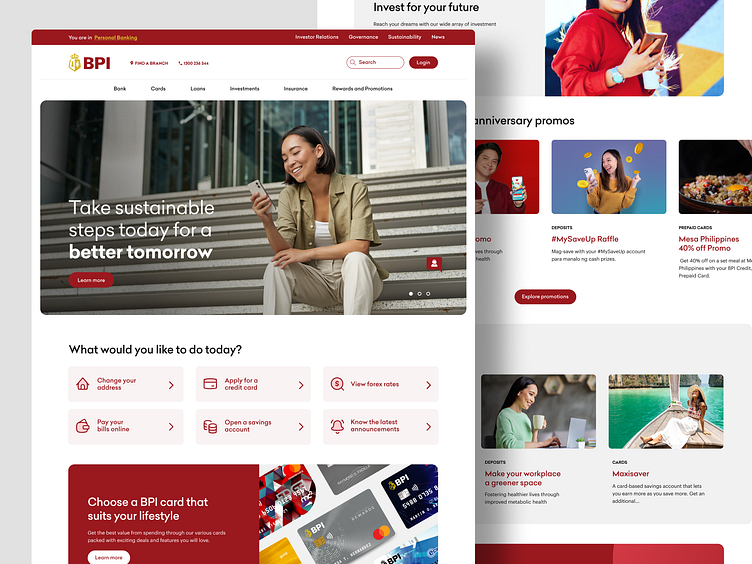
In my recent concept for BPI's landing page, I focused on delivering a clean and user-friendly layout that enhances the overall user experience.
I revamped the icons to make them more intuitive and visibly clickable, ensuring that users can easily access important features. I also added prominent features such as improved navigation, a clear CTA for search and potential login, and a visually appealing hero section that conveys trust and security. The new design not only enhances the visual appeal but also provides a more engaging and efficient platform for BPI's online users.
----------
✌️Got a project in mind? Let's chat! Reach out here or learn more at taplink🚀
More by Carl Aquino View profile
Like

