Login & Signup page


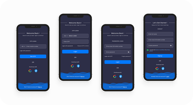


After a careful evaluation of UX inconsistency I design a login & signup page
In the last image you can see some login signup page which i have taken from dribble that are a bad UX for user. Some have issue with color contrast which make a user to put effort to see a text, some contains multiple CTA which end up on same page, using different title for same fields/words, background images that disturbs the text & the content is hard to read or understand.
Content or steps of a signup & login page totally depends upon the company's need, still one should avoid to ask inputs as much as possible & keep the signup process quick.
OTP login & biometric login is sometime which can be used in place of password login.
