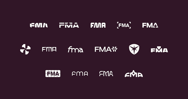
FMA Logomark
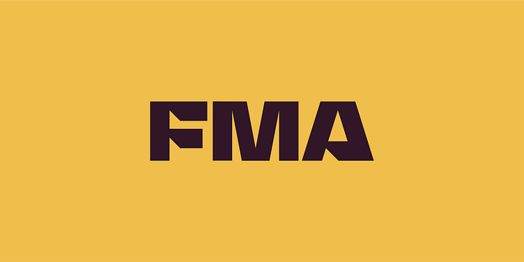
FMA’s logo is inspired by metal shapes — and a direct tie to its newly minted vision statement. As if it were cut from a sheet, the all-custom mark lives and breathes the metal fabrication and manufacturing industry. It’s simple, direct, distinct, and bold. The letterforms pay unmistakable homage to the profession’s history while remaining inventive and futuristic.
Once the teams aligned on this logo direction, we went to work on detailed alterations and refinements to enhance the logo’s stability and legibility. A few tweaks to the scale, and it was ready.
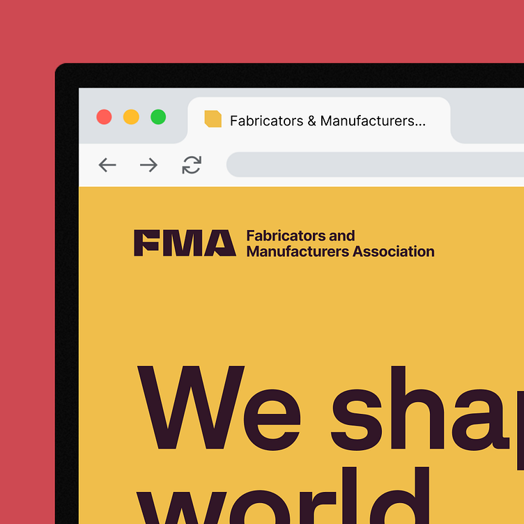
Given both the familiarity of its acronym and the length of FMA’s full name, the logo is used most often. In applications where the full name is needed, we opted for utility by pairing the mark with the brand’s secondary typeface, Inter, in a stacked and horizontal lockup style.
------
Looking for a brand agency? We would love to hear from you.