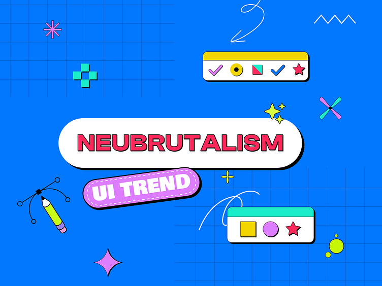
Ui trend of 2023 🎨
Simplicity and Minimalism:
"Neu Brutalism" appears to be a term combining "Neu" (German for "new") and "Brutalism," which is typically associated with a style of architecture and design that emerged in the mid-20th century. While "Brutalism" often refers to architectural designs characterized by raw, concrete structures and minimalist aesthetics, "Neu Brutalism" seems to suggest a contemporary or new interpretation of this style in the context of user interface (UI) design.
Like traditional Brutalism, Neu Brutalism in UI design might emphasize simplicity, stark design elements, and a reduction of unnecessary
Bold Typography and Grids:
This style may favor bold typography, geometric grids, and strong, clear lines, reminiscent of Brutalist architecture's emphasis on form and function.
Examples of neubrutalism in web design
Nowadays, there are multiple and various website examples that incorporate neubrutalism into their layout. One of the most famous examples that often inspire other web creators is the style of Figma and Gumroad. Neubrutalism became a trend as other companies and designers modeled their approach after theirs, adding more depth and ideas to the style. It's always encouraging to see well-known brands try something original like that since it allows the technique to mature and gain a new perspective at the same time. Check out below a few chosen web designs in the new brutalist style and explore even more on Dribbble.
If you like what you see, don't forget the press the 💖and follow me Dribbble and other social platforms to get exciting content and tips.
I upload fresh ideas and freebies on daily basis Dribbble. So make sure you follow me on Dribbble.
Connect With Me On LinkedIn: @bhargavchikhaliya


