Repair Boss (Mobile) App

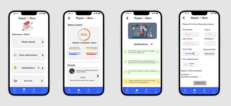
These are images from another mobile case study I created (date: 6/1/22) regarding property maintenance. The goal was to help rebuild trust between tenants and property managers by creating an app where maintenance requests could be placed, viewed, completed and kept on record for both tenants and property management.
What would I change now? The spacing and balance felt really inconsistent while working on the visual design and is definitely something I would address if I had a chance to redo the visuals on this project. Also, the sizing of some elements seem disproportionate and the iconography and text gradually get too close to the edge of the phone screen for my (now) liking. Lastly, the footer should indicate to the user which page they are on throughout the flow of the design (in image #1, there is a dot indicating the user is on the Home Screen. This should continue throughout the design). I believe that utilizing a grid system and consistency would really help eliminate some of the visual errors here in this project.