✨✨Dashboard UI Shot
📣 Exciting news! We’ve just launched a new dashboard UI/UX design for a multinational corporation (MNC), and we’re thrilled to share some details with you.
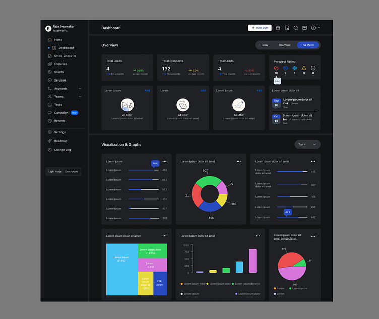
A dashboard is the heart of any software application. It’s the first thing users see when they log in, and it’s where they can access all the features and information they need. 👌A well-designed dashboard can improve productivity, enhance decision-making, and increase user satisfaction.💕
✔ Our new design is focused on simplicity and efficiency. We’ve used clean lines and a minimalist color palette to reduce visual clutter, making it easier for users to focus on the data that matters🤞 most to them. We’ve also incorporated interactive elements that allow users to customize their view, so they can see the information that’s most relevant to their role.
✔ One of the key features of our design is its adaptability✨. The dashboard can be easily customized to suit the needs of different users, from executives who need a high-level overview of company performance, to team leaders who need detailed reports on their projects.👍
✔ We’ve also prioritized accessibility in our design. We’ve used clear, legible fonts and high-contrast colours ✨ to ensure that all users, including those with visual impairments, can easily navigate the dashboard.
✔ We believe that a good dashboard isn’t just about presenting data🎁 - it’s about telling a story. That’s why we’ve incorporated data visualization tools into our design, allowing users to see trends and patterns at a glance.
We’re proud of our new dashboard design, and we believe it will make a big difference in how our MNC client operates. Stay tuned for more updates!
