Redesign Jay jalaram website

User Experience Research Paper: Enhancing 'Jay Jalaram Brick Works' Website
Abstract:
This user experience research paper delves into the redesign of the 'Jay Jalaram Brick Works' website to optimize user interaction and satisfaction. The primary issues addressed include a cluttered header, non-scrolling header, disorganized footer, and an absence of thematic elements. Through thoughtful redesign, the website underwent significant improvements in user experience, navigation, and aesthetics.
Introduction:
The 'Jay Jalaram Brick Works' website aimed to enhance its user experience by addressing key issues that hindered user interaction and visual appeal. The research focused on optimizing navigation, improving the header's functionality, restructuring the footer, and introducing thematic elements.
Methodology:
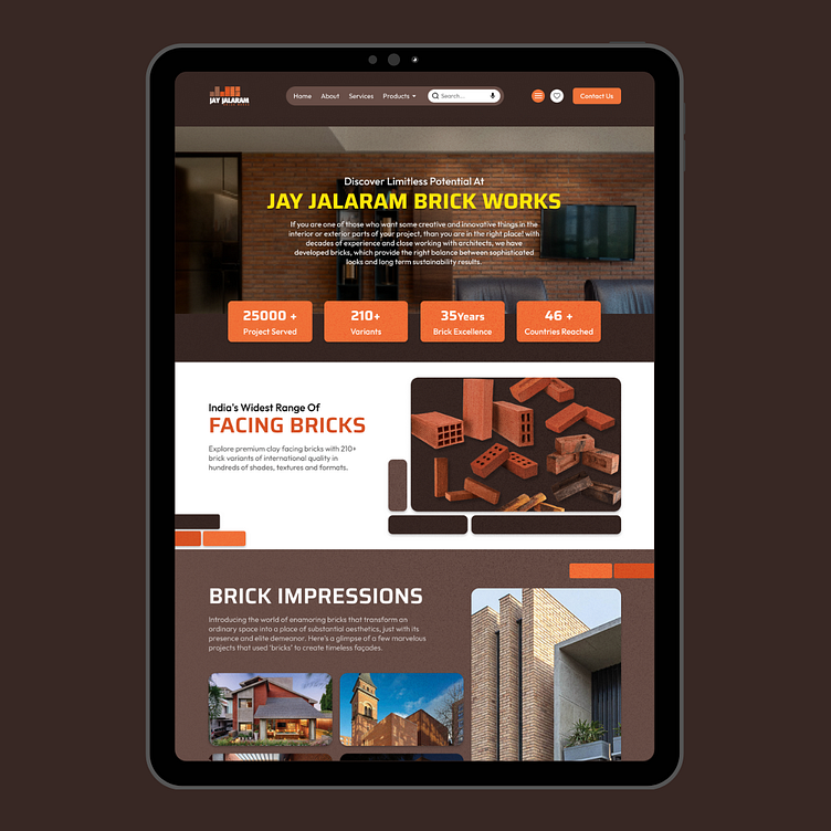
1. Streamlined Navigation: The excessive number of navigation tabs in the header was reduced. Primary navigation items were placed horizontally for quick access, while secondary options were grouped under a hamburger icon for a cleaner interface.
2. Sticky Header: To enhance navigation, the header was made sticky, ensuring it scrolls along with the content for seamless access to vital information.
3. Footer Restructuring: The disorganized footer was revamped. A simplified contact form was added for improved communication. Elements were systematically arranged to reduce confusion and improve usability.
4. Thematic Elements: To reinforce the website's identity, textures and brick illustrations were introduced throughout the website, signifying its core focus on brick selling.
Results:
The redesign led to substantial improvements in user experience. The primary navigation tabs' reorganization reduced clutter, making it easier for users to find essential information quickly. The inclusion of a sticky header improved navigation convenience, allowing users to access vital links from anywhere on the page.
The revamped footer, with a streamlined contact form and organized elements, reduced user confusion and enhanced overall engagement. Users found it easier to communicate with the business, increasing user satisfaction.
The introduction of thematic elements, such as textures and brick illustrations, not only improved visual appeal but also reinforced the website's core theme, making it more memorable for visitors.
Conclusion:
The redesign of the 'Jay Jalaram Brick Works' website successfully tackled usability issues, improving the overall user experience. By streamlining navigation, introducing a sticky header, restructuring the footer, and incorporating thematic elements, the website now offers a clean, intuitive, and engaging interface.
The enhancements implemented in this redesign serve as a testament to the importance of user experience in web design. By prioritizing user needs and aesthetics, 'Jay Jalaram Brick Works' has successfully transformed its website into an inviting and user-friendly platform, poised to attract and retain a broader audience.
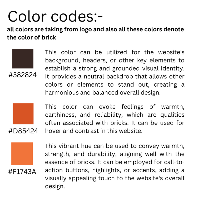
Font family:-
1.Outfit Typeface for Subheadings and Paragraphs: Outfit, with its clean and modern design, was chosen for subheadings and paragraphs. Its readability and versatility ensured a comfortable reading experience, enhancing user engagement with the content.
2.Saire Typeface for Headings: Saire, known for its bold and striking appearance, was employed in headings to create emphasis and draw user attention. Its unique character added a touch of sophistication to the website's visual identity.
View on figma:- https://www.figma.com/file/fnehBNER1BDau2tRmKxs26/burger-app?type=design&node-id=634%3A520&mode=design&t=aHWdU9YotO31Vyax-1
👇 CONTACT FOR NEW PROJECT :
---------------------------------------------
☛ whatsapp :+8979142208
-Follow Me On:
Regards-
Muskan bansal
Thanks for watching it