Personal Trainer Brand Identity

[email protected] | www.maketone.design
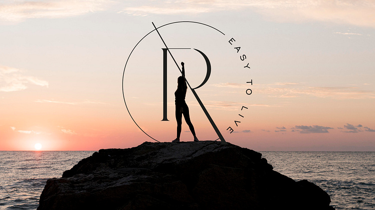
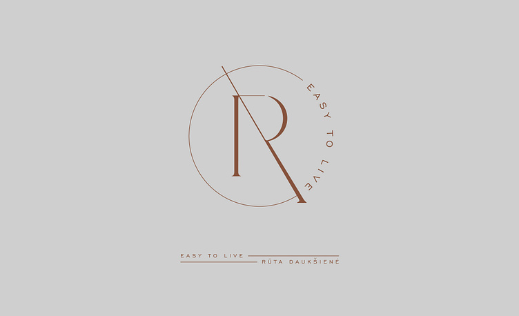
Logo created for a fitness trainer and teacher of a healthy lifestyle.
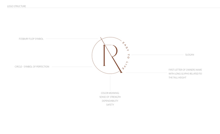
The logo consists of the first letter of the name - R.
The monogram is connected by the slogan "EASY TO LIVE".
The stretched leg of the letter R symbolizes bitterness, creating an allusion of athletics. The inner side of the letter R forms the number "7" converted as an allusion to a polynomial. A signature of the same style is created next to the logo.
Dominant color tones - earthy, natural, active, sporty.
Our client is a professional track and field athlete, a representative of royal sports, Rūta Daukšienė, who prepares personal training program creation services. She helps people enjoy sports and discover the true joy of movement that promotes a healthy, natural process of body shaping change. Her image and “good name” depend on the people she works with personally. So for them, she becomes an adviser, a psychologist, receiving encouragement and support in return.
Positive feedback has led to the creation of her own brand and visual identity that reflects an active lifestyle, simplicity, and quality. So our task is to create a brand of an energetic, positive, active coach that reflects her personality, attitude towards the natural body, freedom of movement, but at the same time is stylish and oriented to a female audience. At the request of the client, we avoided rough, negative, and scandalous emotions.