Scaling Design Systems - IPTS/Shuddle Design System

The Problem
The Interplanetary Transportation System, or IPTS, is taking the universes by storm. With each expansion, they have an opportunity to build a bespoke digital experience for potential travel and transportation customers and investors.
They have spun up several new sites and apps throughout the past few months to keep up with their product offerings and business growth. The first site — ipts.org — was a gorgeous endeavor and proved very useful in selling the leadership team's ideas to investors. With the second site — IPTS Travel — they tried to build an equally beautiful site, but they needed different functionality and had refined a few things along the way that was previously designed for ipts.org. And, they needed a rail booking app for IPTS Rail, like yesterday! So they slapped together an MVP to start selling rail tickets asap... but, the design was VERY different from the others.
So, customers were confused and not many were using their websites.
"Is this the same company?"
"Is this a knock-off site?"
"Can I trust this site with my banking info? It looks fake."
The Solution
The brand team was wracking their brains on how to bring consistency to these complex, related-but-distinct, digital experiences. They could shop out for an agency to create and manage each experience for them, but that seemed costly, cumbersome, and time intensive. They needed to provide cohesion for those potential customers who were on the geofences, and fast.
Their teams had heard of other bigcos using a system — a design system — to bring that cohesion, stability, and ease to market they were longing for. Then, they reached out to me to create a design system.
The Process
Enter the IPTS.org design system.
I quickly got to work, inventorying the elements on each of these sites to identify repeatable patterns and web parts, and looking for opportunities for brand clarity and activation. Using an AI tool, I quickly determined that initial candidates to be made into components that could be used across experiences. These elements would need to be used on all of them at some point:
Logo - Of course, our logos will need to appear prominently on all sites. Componentizing the logo will ensure appropriate padding and provide the variations appropriate for these web experiences.
Navigation - Will this be handled in the same way across all sites? Should it be a component?
Partners & Testimonials - would be a repeatable component
Social - Should we provide Share opportunities or a feed?
Input - to be used for a search field, a login/password field, in forms
Language - because this is interplanetary, we need to ensure that users across the galaxies can understand our content, so a language switch might be needed
Privacy details/ Footer - Uniformity here will quietly ground our experiences and provide some cohesion and familiarity across sites.
I began wireframing the homepages/screens of 3 of their sites/apps to see what other elements came through and were common across experiences.
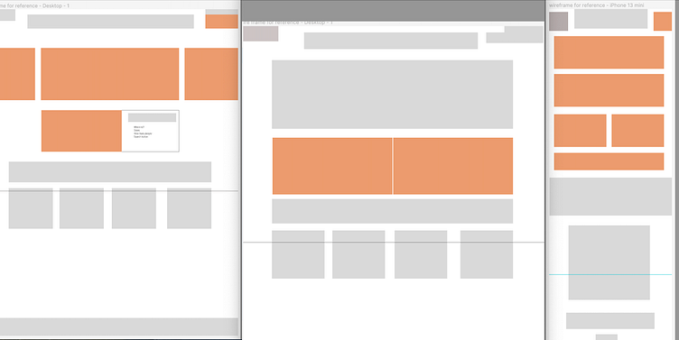
With the repeated elements in hand (gray elements in the wireframes), I began creating each of these experiences in Figma.
Starting small, I decided to create the Logo, LogoHeader, Button for CTAs and actions, Input field, Tile, and Footer as reusable components. I still had a couple other candidates in mind, but would reassess later on. Choosing LogoHeader AND Logo might seem odd, but the policies around IPTS logo treatments is stringent, so I want to ensure uniformity and consistency across experiences.
I published these as a library in Figma, so that I would be ready to implement them into designs from the wireframes.

logo
button
input
tile
With the logo, I was able to make compound component: logo header.
With the logo, I was able to make compound component: footer.
With these 4-5 components, I began applying them to my wireframes to determine feasibility and if there were any other opportunities for components that could be used across all 3 experiences. I was able to begin filling around these main components…
I soon realized that I needed to add the brand color palette and font styles to the my design system library so that the text and colors could be uniform throughout.

With these elements, I was able to create 3 distinct, yet obviously related experiences to communicate the brand and offerings of IPTS.org and it's subsidiaries.


I ended up creating adding icons to further iterate and build out the initial, basic components. The icons served as navigation buttons, switches, Input identifiers, and other simple visual communication.
I also needed to create a couple of product-specific, reusable components. These could potentially be promoted to the universal design system for greater uniformity and flexibility between the brands and products.
For IPTS.org, a splashy Hero component with an image, heading, and subheading was created as well as a new actionable, CTA Card.

For IPTS Travel, I needed to incorporate a robust travel search capability. Using the color and text styles as well as Input component variants, the button component, and a box, the Search Travel compound component was born. I also created a scrollable and clickable slider to feature teasers for travel ideas.

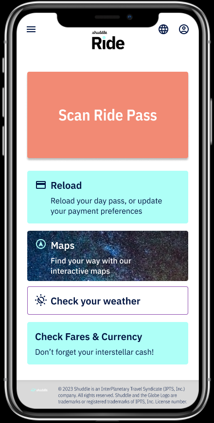
For the IPTS Rail App, users needed a way to quickly open their ticketing info for a conductor to scan. So, a large button and QR code modal was created.

Using a design system accelerated my productivity while infusing consistent branding and usable elements. The client was happy because they could see the ease of use and speed with which I was able to deliver these designs using pre-made component variants.
A Wrench
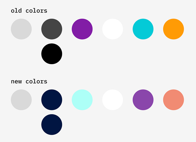
HOWEVER. Just when I thought we were good to go with these components and their variants, IPTS tapped MegaBrand a brand study which revealed that customers thought the name and logo felt very ominous, like it was cold, faceless corporation that was always watching. So, they initiated a rebrand and reached out to me to see how quickly I could incorporate their new colors, logos, and brand principles.

The Rebrand
IPTS.org became the forward-thinking Shuddle
IPTS.Travel became the super-cool Shuddle Visit
IPTS.Rail became the more useful Shuddle Ride
Incidentally, the font styles and colors previously incorporated in my design system were already in line with the new brand. With quick tweaks to the hex values and reorganization of colors variables, I updated all colors fairly quickly. Similarly, I swapped the logos in my Logo component variants with the new and the changes flowed through to the LogoHeader variants and Footer variants.
But, there were a few hiccups!
For instance, because the new primary font color was much more or less saturated than the previously assigned color, the input field variants I had been using were now dark color fields and the contrast ratio was not appropriate for accessibility. And, some hues that were previously accent colors were now promoted to a tertiary and vice versa.
Also, semantically, the logos were set up differently than expected and than in the previous brand design system. So, there was a bit of renaming/reorganization that needed to occur so nothing would break and the logos would still be visible and beautiful. But, it wasn't a big deal once I figured out what needed to happen.
Built to Flex!
But, the design system is built to flex. So, I flexed it. I swapped colors used in the Input component variants to a more user-friendly combo. These automagically flowed through to the input fields in use. It was better, but still a little odd in this instance, so I swapped to a different variant with a different color combo, and viole! An attention grabbing, appropriately branded Search Travel component was back in play. I did this again for a couple other implementations, and provided a couple more simple enhancements support the new "fresh and vibrant" brand directives for good measure.
And, the Results...


In all, swapping out the old for new branding across the 3 sites/apps took about a sprint because of the design system.
In a little under two weeks, the entire family of products had new designs for an inviting, friendly, and fresh look-and-feel!