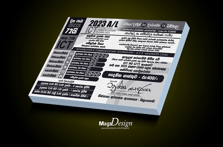
Creative one-color leaflet or handbill design A4/A3 | Photoshop
Creative one-color leaflet or handbill design A4/A3
1. Striking Simplicity: Embrace the power of a single color to create a design that's both bold and elegant. A limited color palette forces you to focus on the essentials, making your message stand out clearly.
2. Effective Use of Negative Space: Make smart use of negative space to balance your design. This can enhance readability and emphasize key information. Remember, simplicity doesn't mean clutter-free; it means using every element purposefully.
3. Typography that Speaks: Choose a typeface that aligns with your message and audience. In one-color design, typography plays a significant role in conveying your brand's identity and the information you want to share.
4. Strategic Placement: Determine where your text, visuals, and call-to-action elements will reside on the leaflet. Prioritize the most critical information, such as headlines and contact details, and ensure they're easily spotted.
5. Branding Consistency: If applicable, maintain consistency with your brand's visual identity. Incorporate your logo, color scheme, and design elements to reinforce brand recognition.
6. Visual Hierarchy: Establish a clear hierarchy to guide the viewer's eye. Your headline should grab attention, followed by subheadings and bullet points to provide context and details.
7. Engaging Imagery: If space allows, include a single, impactful image or graphic element that complements your message. Ensure it's in harmony with your chosen color and enhances the overall aesthetic.
8. Print-Ready Precision: Pay close attention to resolution and print requirements. A one-color design demands precision, as even subtle variations in ink density can affect the final output.
9. Audience Connection: Consider the preferences and expectations of your target audience. How does your design resonate with them? Does it elicit the desired response or action?
10. Call to Action: Don't forget to include a clear call to action. Whether it's to visit a website, make a call, or attend an event, make it easy for your audience to take the next step.
Remember, the essence of a one-color leaflet or handbill design lies in its ability to convey your message with clarity, simplicity, and visual impact. It's a canvas where minimalism meets effectiveness, leaving a lasting impression on your audience.
-----------------------------------------------------------------------------
About Me
-----------------------------------------------------------------------------
🏆 Top Specialties:
- 💼 Brand / Graphic Design (1–2 years)
- 🚀 Product Design (1–2 years)
🏢 Work History:
- 👨💼 CEO at Magzlk.pvt (2020–Present)
🎓 Education:
- 📚 Social Media Marketing & E-commerce, Amezan Lanka Education (2015)
- 💻 Information Technology, SLIATE (2020)
------------------------------------------------------------------------------------------------------------
Let's create visual stories together! 🎨✨
Connect with me for collaborations! 🤝
