FLEX Travel Suitcase | LOGO DESIGN & BRAND IDENTITY

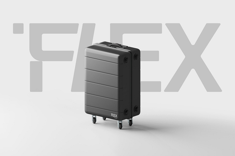
FLEX Travel suitcase brand targets high-end customers with many unique features, so that customers will always be ready for any change on every journey.
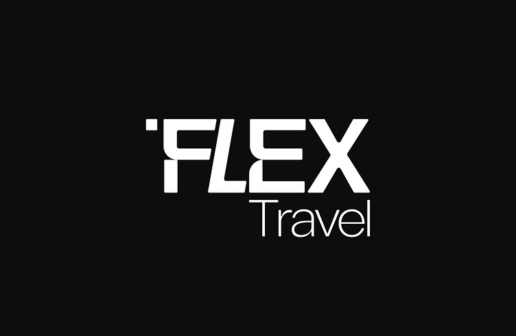
Designing the logo for FLEX Travel, Bee Art chose black, expressing the elegance and class of the brand. The logo is a stylized brand name, with special cropped lines, bringing a modern look thereby affirming the quality of the product. Its versatility and willingness to change characteristics are symbolized by the small square at the beginning of the letter "FLEX". This square can be understood as a suitcase or luggage, a symbol of the journey and readiness for changes and discoveries. The overall design focuses on minimalism, making the logo recognizable and memorable in the customer's impression. The focus on the word "FLEX" and small squares create sophistication, visually appealing to the viewer.
Designed by Bee Art
-
Client Flex Travel
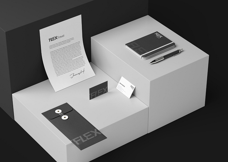
Logo and Branding Project. Logo is designed for a Suitcase Brand in Vietnam.
Copyright © Bee Art. All Right Reserved
Contact us:
• Hotline/ Zalo: 077 34567 18
• Email: [email protected]
• Website: www.beeart.vn
• Facebook: https://www.facebook.com/BeeArt.vn

Conatct us:
• Hotline/ Zalo: (+84) 77 34567 18
• Email: [email protected]
• Facebook: facebook.com/beeart.vn