X15 Data Systems - Redesign Concept

Was speaking to a recent acquaintance and we got to speaking about my profession. They are in the market for some contract work, so, feeling creative I worked on a redesign concept.
Getting Started
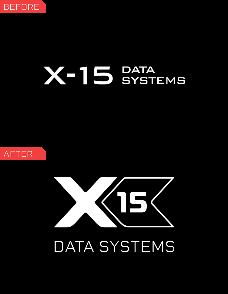
I first focused my energy on a quick rebranding exercise. Since X-15 mostly works as a federal government contractor, I want the brand to feel more technology focused and high tech. I went with a custom design that could was cleaner. Smooth edges on the "X" and the flag encompassing the "15". For typography, I wanted a simple typeface that had sharp angles, like you might see on military planes. This style infers technology and strength, which a brand like this needs to stand out.
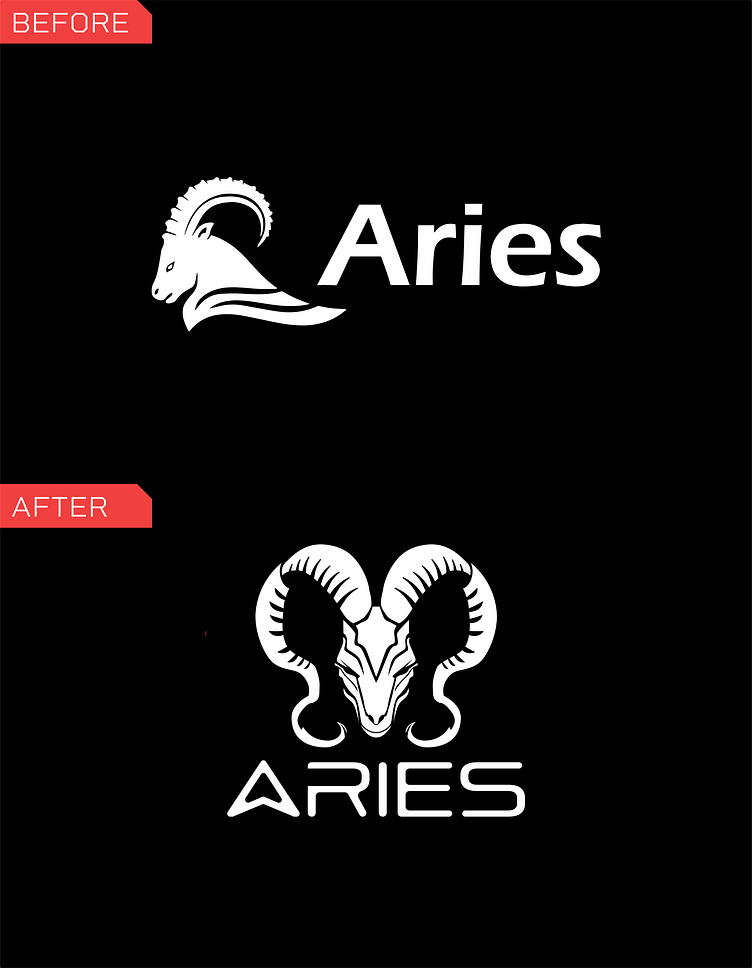
I then focused on the logo of their data program, Aries. The typography was too simplistic and didn't come across as high-tech to me. I reworked the ram's profile to a new head-on view and developed a custom, more futuristic word mark.
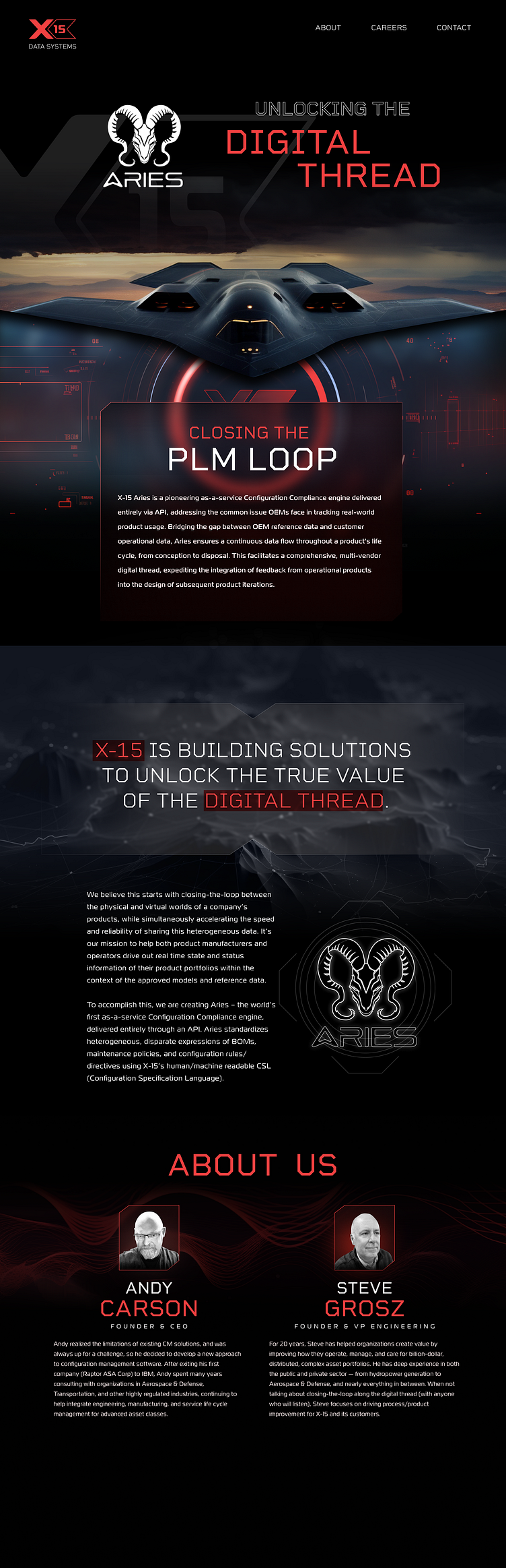
Addressing the Site
The design of the site doesn't really indicate to the user what the company does. So a reimagined version of this based on a lot of the rebranding was necessary. I took stock of what existed and decided on a more clandestine style of design that would quickly imply the company's technical capability and federal contractor status. High contrast colors of black, red and white. A bold big impact graphic at the top with other supplementary imagery focused on data and analytics.
Current Site
