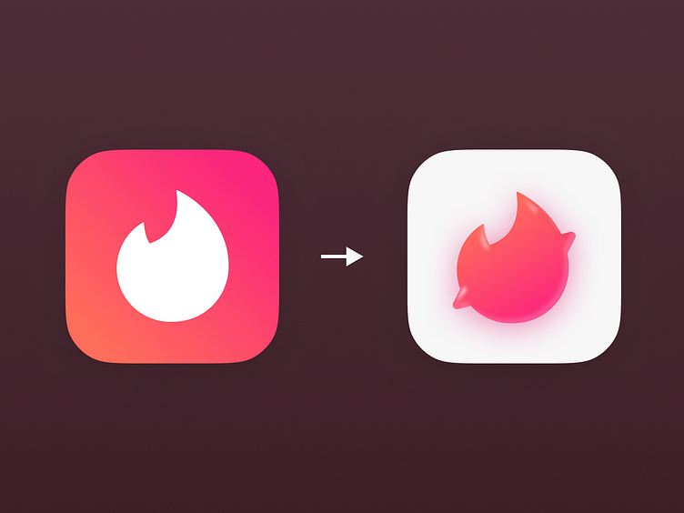
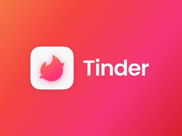
Tinder - App icon redesign concept #19
Tinder app icon redesign concept, featuring an imaginative and playful twist. This time, I've incorporated a heart with left (dislike) and right (like) directional arrows nestled within the flames of the heart icon.
This concept not only reimagines the iconic Tinder logo but also encapsulates the very essence of the platform - the pursuit of love and connection. The directional arrows add a clever and intuitive touch, symbolizing the left and right swipes that have become synonymous with the
Tinder experience. Dive into this creative journey that harmoniously combines the platform's core functionality with a fresh and dynamic design, offering a unique and engaging perspective on the Tinder icon.
Explore this concept that envisions a Tinder icon that celebrates the excitement and possibilities of modern dating, all captured within the heart of a logo.