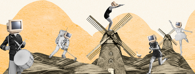
rebrand for my own design venture

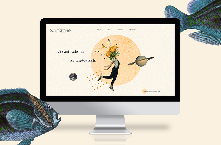
Collages, warm colors, a bit of absurdism, personal copy. As always, trying to keep my graphic elements limited in order to create a coherent whole, without getting boring. Creative use of a few chosen elements. (paper texture, only 2 fonts and one italic version, simple site structure. Warm and creative, with a good dose of "don't take yourself too damn seriously".