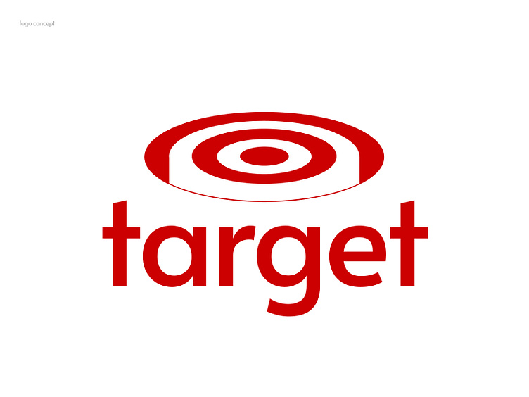
Elevating Simplicity: A Concept Logo for Target
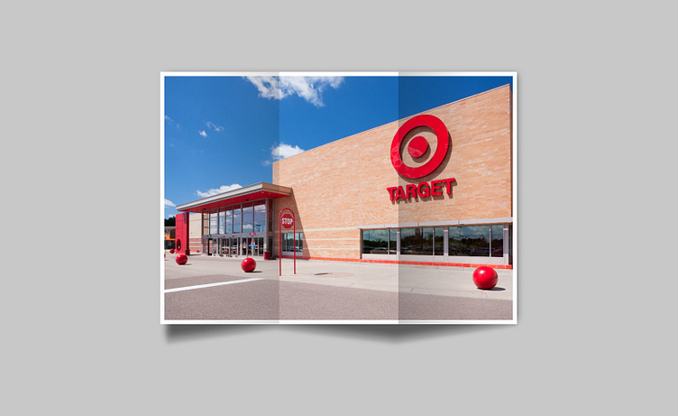
🎯 The challenge: I went to Target last week, glanced at the iconic logo, and couldn't help but wonder, "What if?" The challenge beckoned—to add depth while preserving its beloved simplicity.
It was an opportunity to breathe new life into a classic.
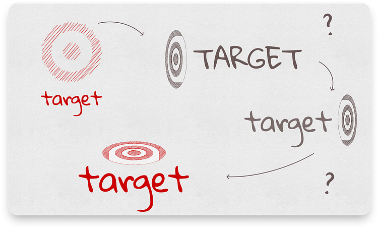
💡 My Creative Approach: My aim was to enhance the logo's visual appeal by introducing subtle layers that create a sense of depth. This called for a delicate balance between tradition and innovation.

🌟 The Result: The concept logo retains the essence of the familiar bullseye while offering a contemporary twist. It's a logo that still feels like Target, but with a newfound dimension that's visually captivating.

🚀 Why It Matters: This project matters because it demonstrates the potential of a timeless logo to evolve without losing its core identity. It showcases the creative possibilities in design while honoring an iconic brand.