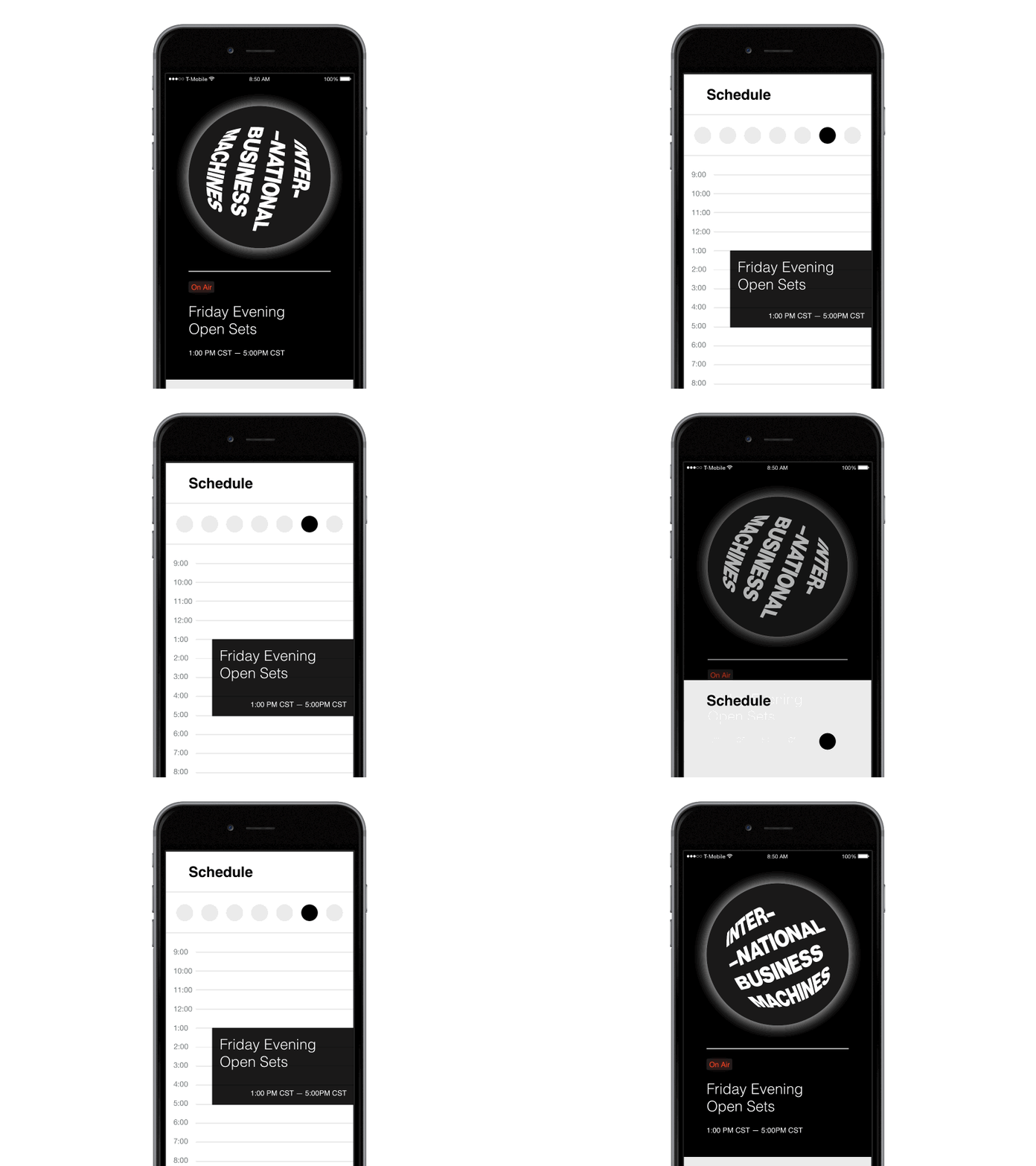
IBM Community Radio — Mobile Interface
While we're working on implementing a v2 of our web-based community radio at IBM, I've been playing around with how we might potentially represent the player/schedule if someone wanted access from a phone (or a potential mini-player like iTunes offers).
This shot is a rough pass over the general interaction model. I'll be filling in gaps, such as the finer points of navigating the schedule and how playing/pausing the stream works.
Right now, I'm utilizing animation curves defined by our Animation Design Language — if you notice, the schedule card is summoned at a certain speed, and its' dismissal is quite a bit speedier, to allow a user to view the content behind it more efficiently. Check out our guide here:
http://www.ibm.com/design/language/framework/animation/fundamentals
You can view the prototype on the web, or on an iPhone 6 Plus here:
http://labs.edouard.us/prototyping/framer/mobile-radio.framer/index.html


