HelpSpot - Logo Concept Revised 🧡
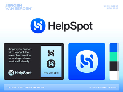
Logo design for HelpSpot - Concept 01 - Revised (v2)
Amplify your support with HelpSpot: the streamlined solution for scaling customer service effortlessly.
Revised concept exploration after first round of client feedback. Needed to make sure the previous chat bubbles didn't looked too much like water drops. Also, the colors where too much amplifying water and drops (and Shazam).
Excited to hear your thoughts and points of feedback on this renewed version.
Hit L for support! 🧡
___________________________________________________________________________________
___________________________________________________________________________________
Let's work together and elevate your brand! 🚀
Feel free to reach out via Dribbble DM or E-mail:
🎬 Check my YouTube for Logo Tutorials / Learn Logo Design
🛒 Buy my pre-made or unused logos from the portfolio
More by Jeroen van Eerden View profile
Services by Jeroen van Eerden
Like

