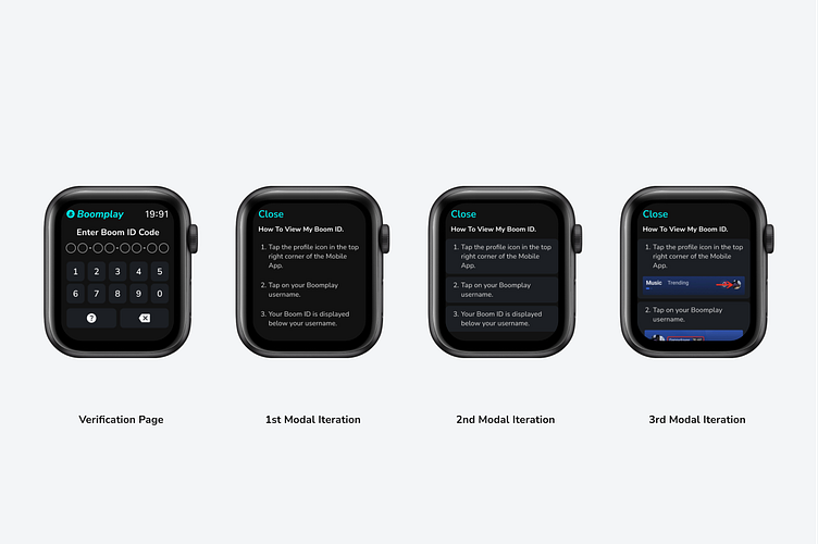
Account Verification process for a watchOS Music Streaming app.
Context: The screens above include a login confirmation page and three variations of a modal "how to" page. The "how to" page seeks to make the process of locating a user's Boom ID easier.
Verification Page
The first screen users interact with. Here, they are requested to provide their "Boom ID Code" to access their Boomplay account on their Apple Watch.The two significant buttons are "backspace" and "help". When tapped the Help button prompts a "How to" Modal.
1st Modal Iteration
Here, a straightforward, easy-to-read, text-only interface was used to provide users with information they could glance over.
2nd Modal Iteration
By creating cards and adding a lighter shade background, I was able to create a new look for the steps. This made the steps stand out (pop😅).
3rd Modal Iteration
The third modal Iteration was where I had a "eureka" moment. I asked myself...
"How would customers use navigate Boomplay if they discovered it for the first time on the Apple Watch App Store?"
I notice how Apple uses lots of visual representation on their support websites to help new and existing users/customers solve a problem. Displaying visual interfaces of a particular problem or steps guides users to a better understanding of how to solve their problem(s).
Conclusion
The three iterations show different ways information can be displayed on an Apple Watch user interface. Each has additional UX to help different sets of users read each step easily.
Thank you so much for reading!
Email me at [email protected]
What do you think? Let me know in the comments.


