Designing for the Small Screen: Mobile-First Matters 📱

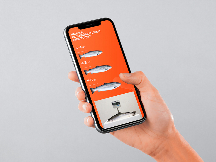
In today's digital landscape, ensuring your website shines on mobile devices is paramount. In my recent project with Aquaproduct, we embraced a 'mobile-first' approach. The site adapts seamlessly to smaller screens, maintaining its stunning visuals and user-friendly experience. Because, let's face it, great design should be accessible anywhere and everywhere!