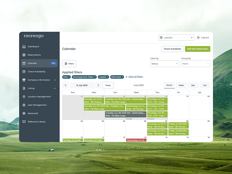
Calendar page on the rental marketplace - Redesign results
📆 Exciting News: Calendar Page Redesign Results! 📅
We're thrilled to unveil the fantastic results of our recent calendar page redesign. Our team has been hard at work, and we're confident you'll love the improvements we've made.
🎨 New Look and Feel: We've introduced a sleek, consistent design with vibrant colors that make navigation a breeze. The page now exudes a modern and user-friendly vibe.
🚀 Create Reservations Effortlessly: The "Create Reservation" button takes center stage, making it easier than ever to book your perfect rental.
🧹 Clean and Smart Filters: Filtering has been streamlined for your convenience. Find what you need quickly with our clean and efficient filters.
📊 Group and Organize: Now, the reservations can be grouped by paid status and listing type, offering better organization and insights.
📅 'Today View' by Default: Our default view now starts with the "Today View" for a quick snapshot of your day.
🗓️ Versatile Viewing Options: Choose your preferred view with ease—whether it's month, week, day, or list view.
💌 Rich Reservation Cards: Reservation cards now display essential details, including listing type, and provide additional information when you hover over them.
We’re thrilled with the outcome and are even more excited to share it with the design community. Take a look at the full case study here.
Show some love by pressing “L”, and save it for later inspiration.
Follow ElifTech Dribbble for more cool staff and the ElifTech website to explore more of our design and development services. Drop your business inquiry here and let us know about your next project.

