BOMBO App UX Heuristics & UI Improvements —2023
As a fanlover of EDM, I am using "BOMBO (wearebombo.com)" without their consent to improve its usability and user experience/user interface.

UX Improvements
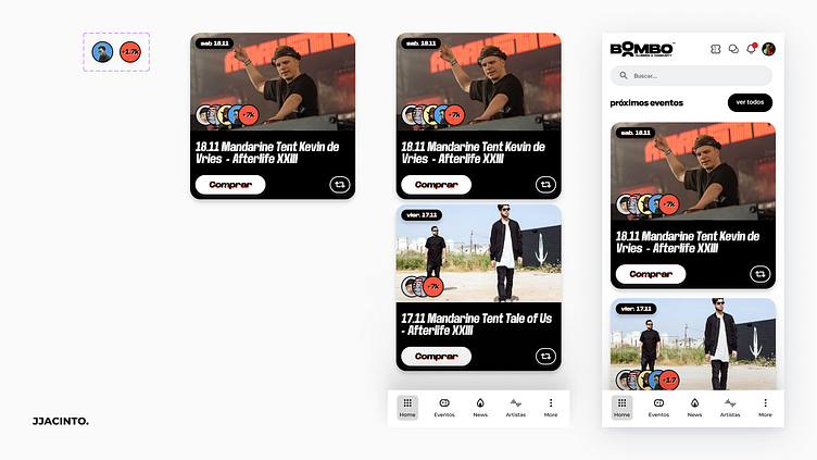
As a UX designer, I always strive to improve the usability and user experience of the products I work on. That’s why I have recently made some changes to some of the components of this app, such as call to actions, cards, labels, and menu. In this blog post, I will explain the rationale behind these changes and how they are based on some of the UX heuristics that guide my design decisions.
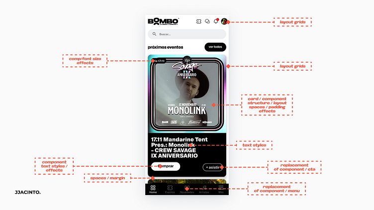

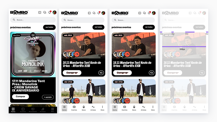
I have redesigned the call to actions on the app to make them more noticeable, clear, and persuasive. For example, I have increased their size, contrast and colors, used rounded corners and shadows effects.
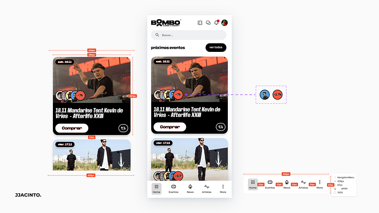
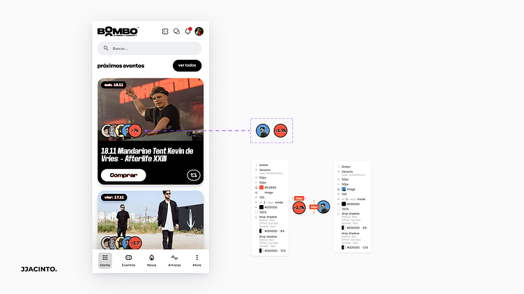
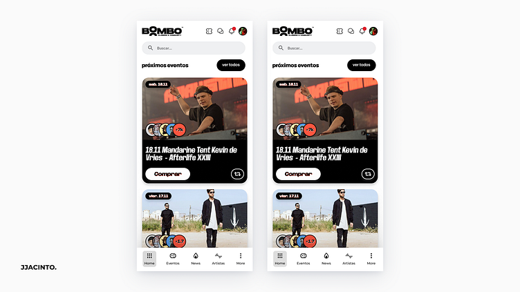
I have reduced the amount of visual elements on cards, used whitespace and alignment to create harmony and balance. I have added avatars, to let the users know about how many people are they gonna attempt to the event, even if these persons are their friends/followers.
"Flexibility and efficiency of use", "Aesthetic and minimalist design", "Recognition rather than recall", "Consistency and standards" are some of the heuristics I have used to redesign this app's home screen.
Juan Manuel Jacinto,UX/UI & IxD Accessibility Designer.
I am in continue movement looking forward to achieve my personal and professional goals. I believe the user experience is everything to sell a product or turn one to be more successful.
