Tech Sales Dashboard
Hello Everyone 👋
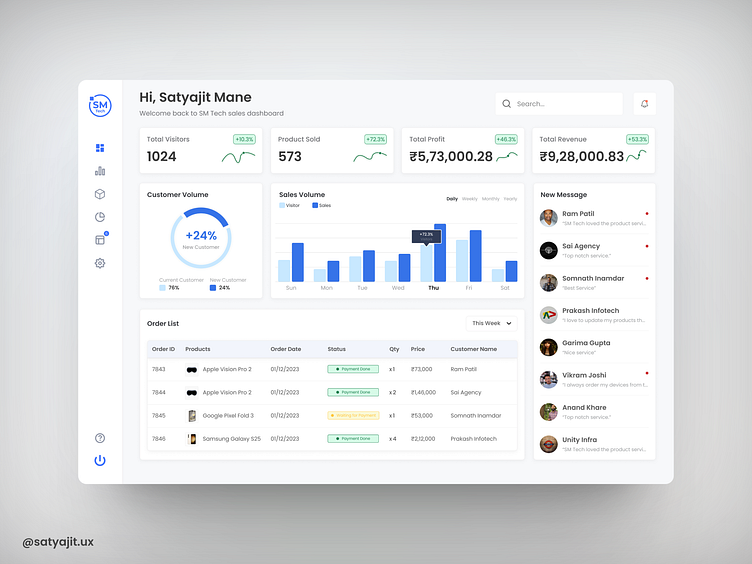
The Tech Sales Dashboard, product design seamlessly blends aesthetics and functionality to deliver an exceptional user experience. The interface boasts a clean intuitive layout, with a modern and minimalist design that puts the focus squarely on the data. The color scheme strikes a harmonious balance, using a combination of calming blues and vibrant accent colors to draw attention to critical metrics and trends.
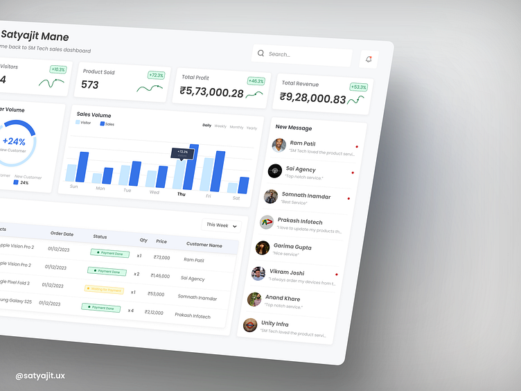
Navigating through the dashboard is a breeze with a well-organized menu system and strategically placed content. Users can effortlessly access vital information, track sales performance and make informed decisions. The inclusion of interactive charts and graphs enhances data comprehension, allowing users to delve into intricate details effortlessly.
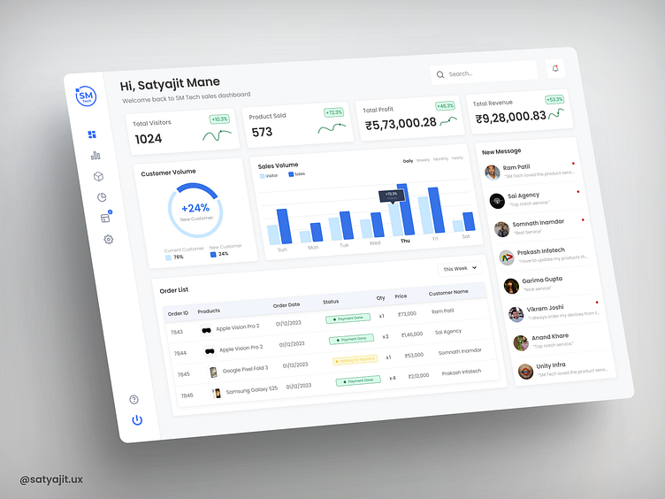
Whether it's filtering data by date, region, or product category, the dashboard offers flexibility for a personalized experience. Additionally, responsive design ensures that the dashboard is accessible and functional across various devices, from desktops to mobile phones, without sacrificing usability.
I'm really grateful for your careful review of my designs. Your feedback and encouragement inspire me to keep improving my skills and creating even more innovative work.