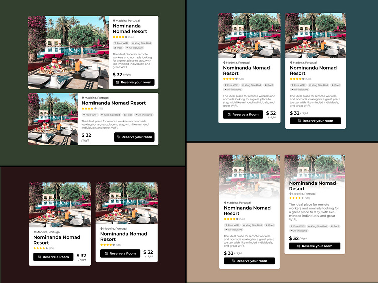
Travel Booking UI Card Variations
As a UI designer, creating multiple versions of a UI card design, experimenting with elements like button placement and visual hierarchy, is crucial to discover the most effective and user-friendly design. It allows us to explore different possibilities, gather valuable user feedback, and ultimately refine the interface to ensure it maximizes usability and engagement. This iterative approach ensures that we don't settle for the first idea but instead strive for continuous improvement, resulting in a final design that truly resonates with the users and delivers the best possible user experience.
Which designs do you like most?
(Green, Blue, Redbrown, Beige; n° 1 or 2)
More by Olivier Leirman View profile
Like
