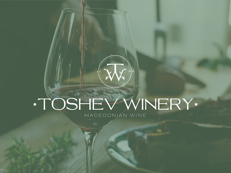
LOGO AND BRAND DESIGN - Toshev Winery

~ It is with joy and pleasure that I present to you the design of the logo and visual identity for Toshev Winery, and read more about this project below 🍷👇
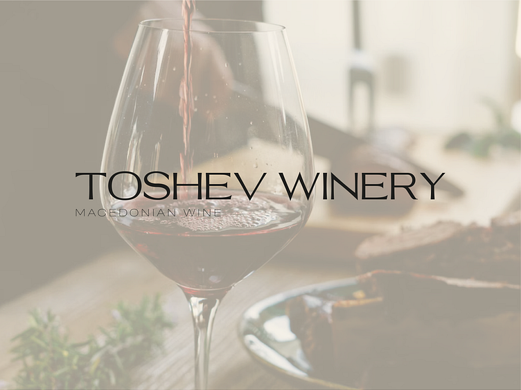
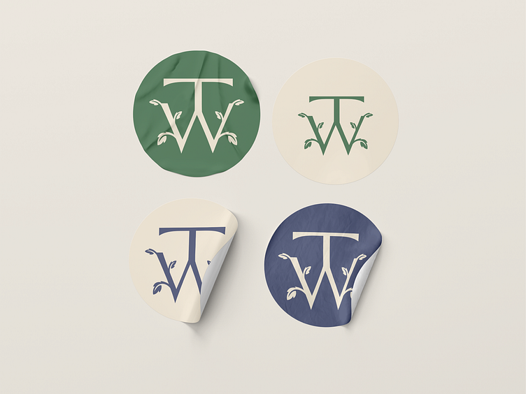
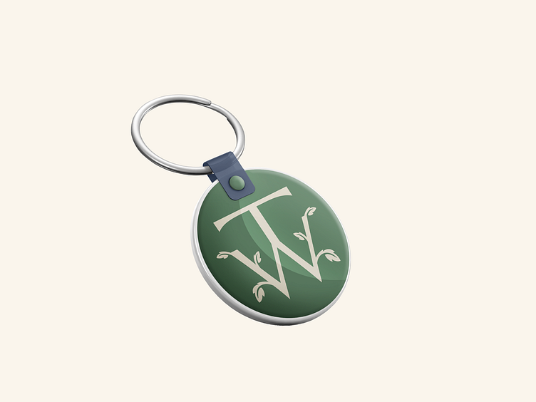
- So, Toshev Winery is a winery from Macedonia that produces organic, premium wines of the highest quality. As part of this visual identity, there are the main logo, alternative logo, brand icon, color palette, as well as fonts, i.e. brand typography. The logo symbol is a combination of the initials of the brand name, i.e. the letters T and W, as well as the motif of the vine leaf 🌿, which in a simple, clear and unambiguous way visually represent the activities of the brand, i.e. the winery. It is a modern, elegant, luxurious, unique and innovative design that, through its logo, colors, fonts, style and other elements, in the right and desired way visually represents the activities, values and characteristics of the brand that needed to be highlighted 😊💯🎨.
-> T + W + 🌿 = Logo concept
-> How do you like it? Write to me in the comments! 😊💬👍
----------------------------------------------------------------------------------------------------
- If you need a design, write to me! I will be happy to help you visually present and improve your business with a graphic product!
Contact me on: [email protected]
Let's connect: Instagram