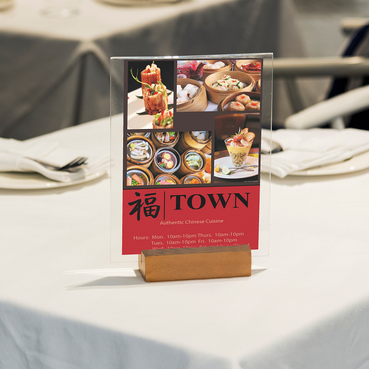
Town Table Tent
Town is a high-end Chinese restaurant that offers authentic Chinese cuisine and hosts events for any occasion. In addition, they have musicians playing classical music while customers enjoy their meals to enhance the fine dining experience they provide. Their target audience is older adults with an interest in elegant dining and lifestyle overall. High society people and no children allowed. The goal for this college project was to design two marketing tools of my choice. The colors and fonts, and logo were preselected.
For the first design, I chose to create a table tent because I always found them to be unique, not every restaurant has them, and some may even think they’re useless. It’s a great way to help people remember important information about a business while they are waiting for their food. For the top portion of the table tent, I added a collage of images to mimic a red block pattern I used for the second design, the menu, to ensure brand consistency. I made sure the visual weight was even by using an equal number of portrait and landscape images. For the images themselves, I chose vibrant ones with some showing a variety of food to keep it interesting. For the background, I chose a dark gray color to contrast the bright colors of the photos. I wanted the design to look professional but not too serious. I found that gray was the perfect balance because it’s a neutral color, adding to the minimalism that’s popular in elegant brands. For the bottom of the design, I changed the background to red, used a black variation of the logo, and added the slogan and hours of operation. I switched the background to red because I wanted to utilize the main color of the brand. It’s also a great contrast with the dark gray color. A black variation of the logo was used because it is the color of professionalism and elegance. I really wanted to make sure I stick to mainly neutral colors to maintain the elegance of the brand. In white are the slogan, Authentic Chinese Cuisine, and the hours of operation. I chose to add the hours because that information isn’t shared enough in my opinion. It’s usually on the door or menu but once a customer orders their food, they aren’t exposed to that information and it’s helpful to be reminded. Thank you for reading this far! I hope this description gives you an idea of my thought process!
(Mockup: <a href="https://www.freepik.com/free-photo/qr-code-restaurant-menu_42082226.htm#query=table%20tent%20mockup&position=11&from_view=keyword&track=ais">Freepik</a>)

