Logo & Business Card Design for Dietitian Tansu Ç.

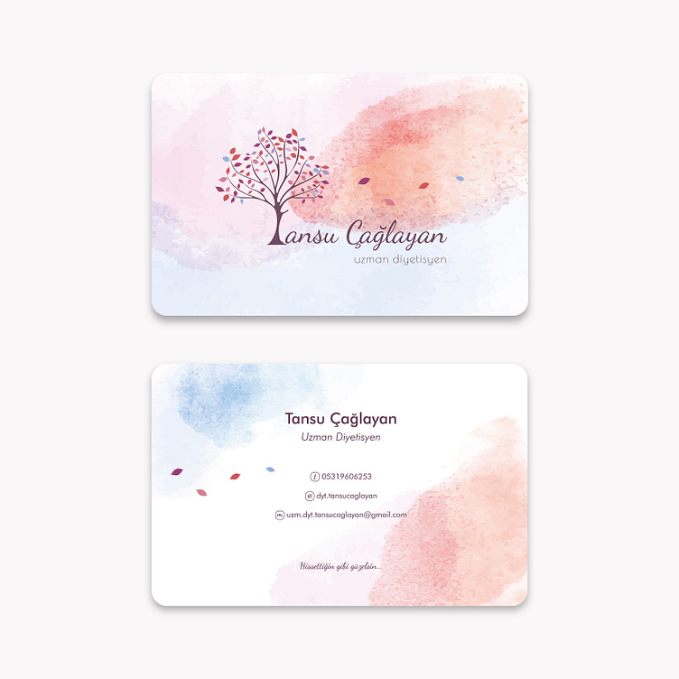
Logo and corporate identity design we prepared for Dietitian Tansu Çağlayan. (Business card and letterhead design)
In this signature logo design that we created using a colorful tree and leaf figures flying away; We wanted to symbolize the person who is liberated with the color and lightness that living in accordance with our nature adds to our lives.
🌳 The tree we use in our logo is a powerful symbol of luck, healing and health. In the history of the world, the tree has been seen as God's gift to man. It has been the protector of man with its miracle-filled features that draw attention with its presence on the biological side in terms of balancing many natural phenomena as well as being seen as a tool in talking to God.
🍃 Leaf; It is a symbol of new beginnings, struggle and the cycle of life. Leaves born in the spring take on various shades throughout their lives and fall to the ground in the fall and continue to give life to nature by blending into the soil. Until a leaf is born again in spring and falls again in fall...🍂
This cycle of life and rebirth goes on and on 🌱
🍀 The human life cycle, just like the story of the leaf, is woven with beginnings, struggles, endings and rebirths.
🌅 Perhaps now is the time for man to break away from the branch he clings to, return to his essence and become free.
...
Font Used: Dancing Script
Copyright © 2023 All Rights Reserved. | designed by egemen erol & merve erol
®️ You can contact me via e-mail or whatsapp for all your corporate identity and brand design projects such as logo design, web design, printed product designs. You can make a video or audio call appointment to discuss the details.