Hop Pursuit Case Study
Here's a new beer label project I recently finished for Fontana, California's Alberta Lane Brewing. Alberta Lane is a small batch operation and was looking for a fill-in-the-blank label design for 16oz cans that could be used for their rotating selection of hop forward beers.
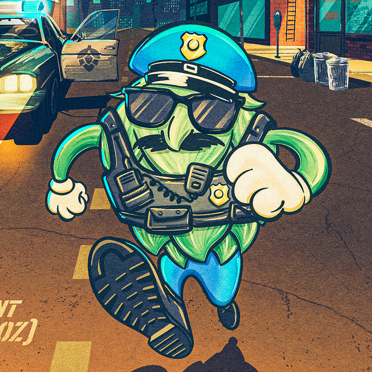
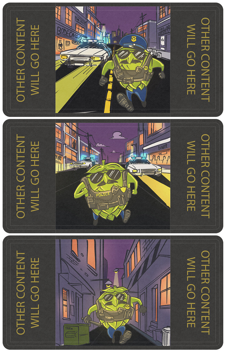
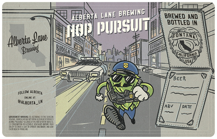
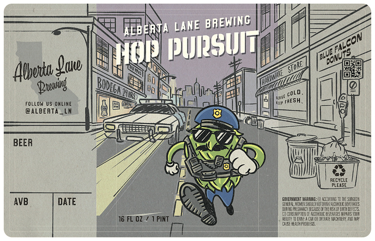
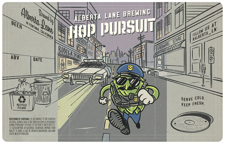
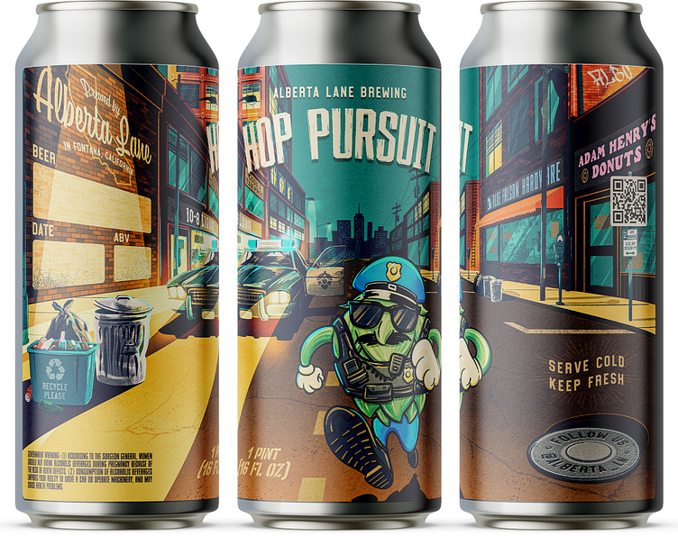
The brief was essentially: it would be funny if there was a hop bud police officer in the middle of a chase. What can you do with that?
Key Art
We knew right off the bat that the label would be illustration focused and that's why Alberta Lane came to me – I really thrive on projects where some mix of packaging, branding, and illustration is in play.
So, right off the bat I got working on some ideas for what this hop cop might look like and what kind of environment he might be operating in. Here's some of those rough sketches.
Design Composition
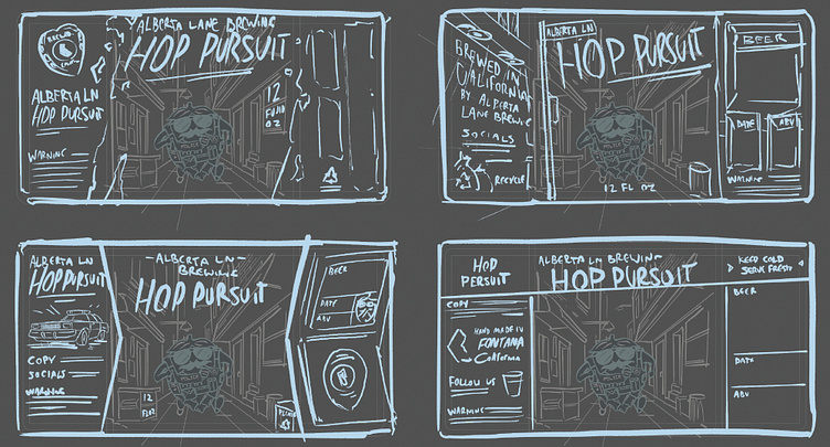
In parallel to the key art I was thinking around the various ways we could incorporate design elements into the label and have them gel nicely with the illustrative work.
I began with some really rough sketches to get my mind churning and once the client had narrowed down the officer and background design they wanted to proceed with, I moved into higher fidelity composition sketches.
Some of them I tried to more deeply integrate with the art so that the illustration and many of the design elements were wholly combined and not just a case of "here's the art, and here's a block of text on either side."
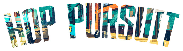
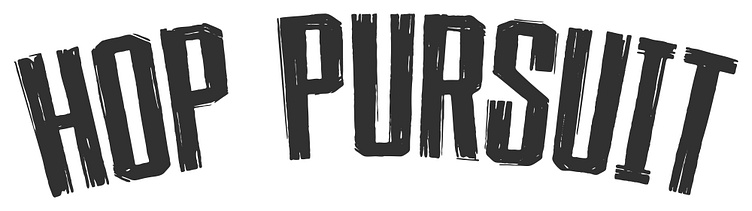
Title Typography
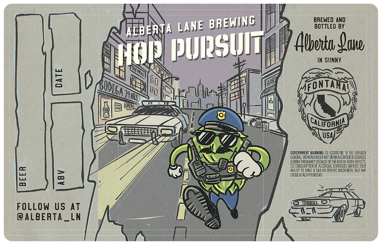
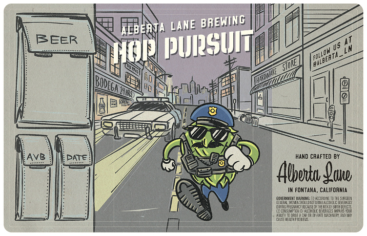
The label also needed a punchy, kind of pulpy piece of headline type. It also needed to be fairly condensed as the title was pretty long and on a typical can you only have around 2 1/2 inches of prime real estate on the front for content you can see without turning the can.
So that seemed like a great opportunity to hand letter the design.
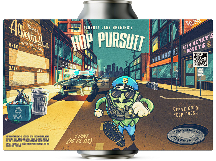
Final Artwork
The Client was loving the last of the above composition sketches. They really appreciated how the design and art didn't really begin or end and were all tightly combined into a cohesive design. Something that would invite their customers to really spend some time taking in all the details and living in the little world we had created.
The fill-in-the-blank portion of the label is a wall mural on brick. The QR code is a street sign. The fluid volume information is painted on the road. Their Instagram handle is imprinted in the manhole cover. And my favorite was to add the "please recycle" emblem as an actual design on a recycling bin on the side of the road.
We also included some insider police lingo in the names of businesses in the background. I'll let you google those for yourself.
In Conclusion
I think this is just a great example of a client finding the right designer for their brief and letting them do what they do best and trusting in the process. It's easily one of my favorite beer labels to date and I'm excited that we'll be tackling some more projects together going forward.