Mobile Banking: Dashboard Design for an Indian Bank
Hello, friends! 🫶🏻
In times of digitalization, various apps have show significant improvement in better user experience and visual designs but Indian Banking apps are still lacking behind. Today, I want to introduce you to a concept of a modern day mobile banking app concept.
The exploration is done for one of India's largest banks. The design is inspired by the bank's brand identity and features a clean, modern look and feel. The design is divided into two screens:
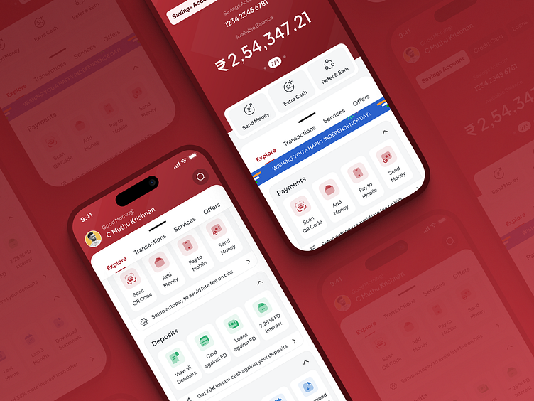
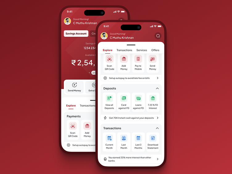
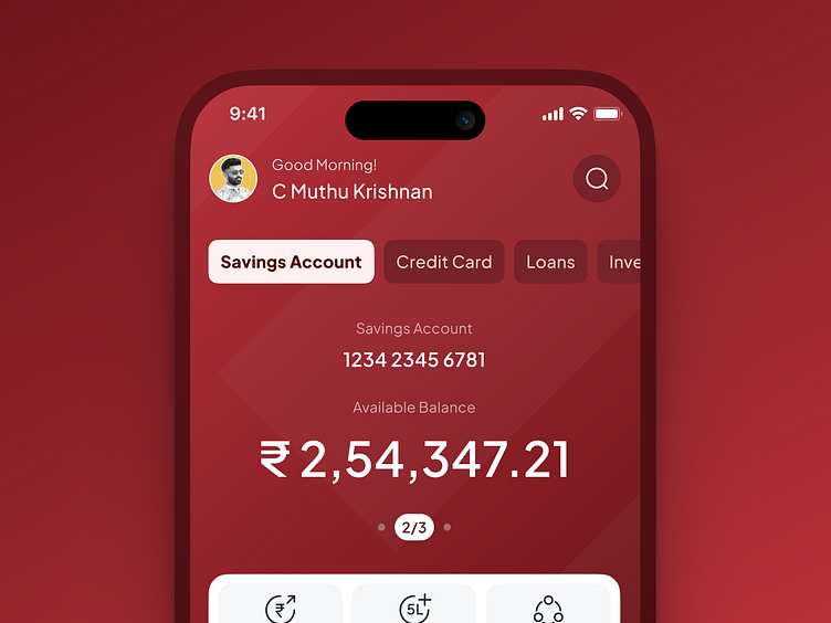
Overview: This screen provides a high-level overview of the user's account balance, recent transactions, and upcoming payments, offer to avail and many more
Scrolled state: This state expresses how the designs can have various sections enhancing the branding and making it easier for the users to explore different features of the bank.
Design Details:
The design of the mobile banking dashboard is based on the following principles:
Clarity: The dashboard is designed to be clear and easy to understand. The text is large and easy to read, and the icons are clear and concise.
Simplicity: The dashboard is designed to be simple and uncluttered. The focus is on the information that is most important to the user, and the design is free of unnecessary distractions.
Personalization: The dashboard can be personalized to the user's needs. The user can choose to display different information as they avail different offerings from the bank on this screen.

Share the designs and Press “L” to show some love ❤️
Interested to work with me? Drop a message: [email protected]
🔗 My social profiles: Twitter | LinkedIn | ADPList
Thank You
