AllSTARSIT Logo Redesign
Hey!
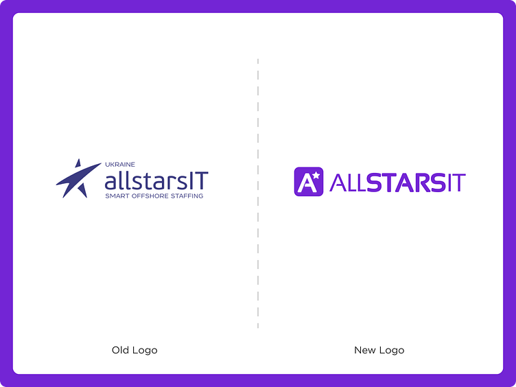
I want to present the redesigned AllSTARSIT logo.
The main idea was to make it simple, refresh the main color for a more trendy and bright look.
The logo combines an icon style and type font that makes it scalable for use in different visual communications. In this case, I'll be presenting the idea, logo creation, concept, and real examples of placement and usage of the logo.
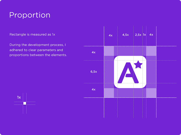
Conceptualizing Innovation:
My journey began with a deep dive into the heart of the AllSTARSIT brand. Understanding the essence of the company, its values, and its aspirations formed the cornerstone of our redesign. The central idea was to seamlessly blend modern aesthetics with the brand's established identity.
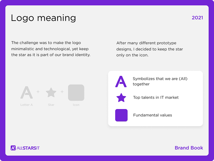
Crafting the Icon:
The icon, a symphony of clean lines and striking symbolism, captures the essence of AllSTARSIT's dynamic vision. A harmonious fusion of elements, it portrays growth, connectivity, and progress. The streamlined design ensures its versatility across diverse mediums, from business cards to digital platforms.
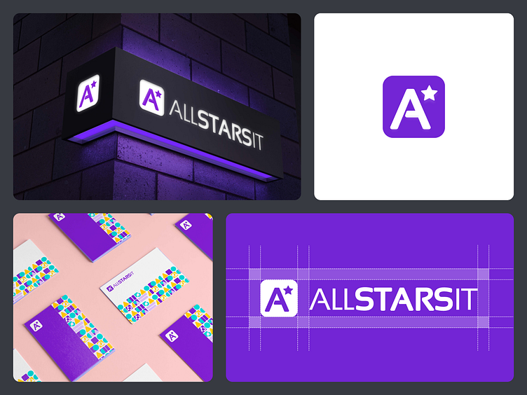
Real examples of placement and usage of the logo


Press ❤️ if you like my design, and share your feedback!
I'm available for full-time or freelance work