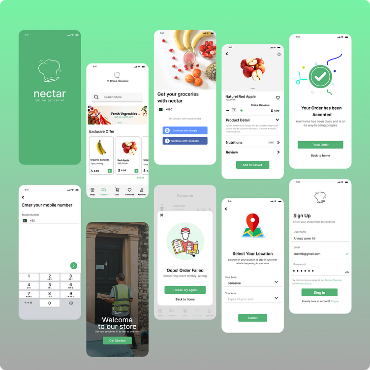
Food Ordering App
Title: Crafting an Appetizing User Experience: Designing a Food Delivery App UI
Introduction:
In the ever-evolving landscape of mobile applications, designing a user interface that seamlessly merges aesthetics with functionality has become paramount. In this blog, we delve into the thought process and considerations that went into creating a captivating food delivery app UI using Figma. As a Flutter developer with a passion for creating exceptional user experiences, I embarked on this design journey to showcase the delectable world of digital dining.
User-Centered Design:
At the core of this food delivery app's UI design was the user's experience. Understanding the end user's needs, preferences, and behaviors was key to crafting an interface that resonates. By empathizing with users, I was able to conceptualize a design that offers intuitive navigation, easy-to-use controls, and a visually pleasing layout.
Seamless Navigation:
Navigational flow can make or break a user's engagement with an app. To ensure a seamless experience, I focused on designing a clear and concise navigation structure. This included an uncluttered bottom navigation bar that provided quick access to essential sections like home, menu, orders, and profile. Additionally, implementing a search bar prominently enabled users to find their desired dishes effortlessly.
Visual Language:
The color palette and visual elements used in the design were carefully chosen to evoke feelings of hunger, comfort, and delight. Warm and inviting colors, such as rich reds and deep oranges, were employed to stimulate appetite and create a sense of indulgence. Vibrant food imagery was strategically placed to tantalize the user's taste buds and showcase the app's offerings.
Intuitive Ordering Process:
Streamlining the ordering process was a top priority. I introduced a user-friendly cart interface that displayed selected items, their quantities, and prices. This provided transparency and control to users as they tailored their orders. Integrating a 'Customize' feature for each dish allowed users to personalize their selections, catering to diverse tastes and dietary preferences.
Real-Time Tracking:
Incorporating real-time order tracking enhanced user trust and satisfaction. Users can monitor the status of their orders from confirmation to delivery, creating a sense of anticipation and excitement. Timely notifications were designed to keep users informed at each step, eliminating uncertainty and fostering engagement.
Adaptive Design:
Given the dynamic nature of the food industry, ensuring a responsive and adaptive design was imperative. The UI was designed to seamlessly adapt to various screen sizes, ensuring consistent functionality and aesthetics across smartphones and tablets. This adaptability extends the app's reach and accommodates users with diverse devices.
Conclusion:
Designing a food delivery app UI that marries functionality with visual allure is an intricate dance of creativity and empathy. By keeping the end user at the forefront and merging a user-centered approach with meticulous design choices, this UI aims to redefine the digital dining experience. As a Flutter developer working towards a future in business, this design journey has fortified my belief in the power of exceptional user experiences to drive success in the competitive app market.
