Utime Logotype
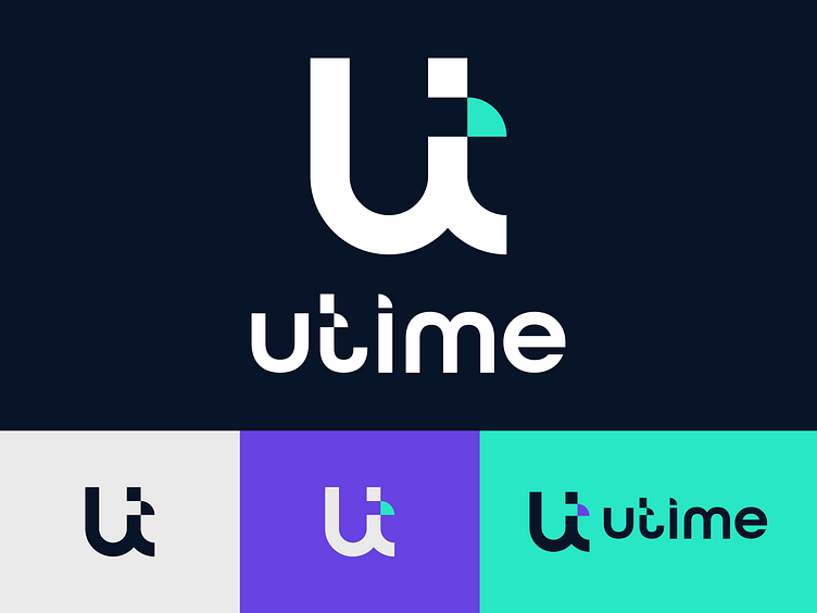
Hello friends! This Monday we're bursting into something exciting! U-Time is an online banking that will help you quickly and safely administer your finances from anywhere in the world.The logo is a combined U and T, the separated small square of the U is a pixel that shows that the brand is from the online services industry. The name refers to the time, where U is "Your" and "T" is the time. Also, the letter U is used in branding as a pattern for greater recognition.For the brand, we have selected colors such as Light Violet, Neon Green, and Timid White, which most of all emphasize the area where the brand operates.We are looking forward to reactions and evaluations of our work, it is very important for us! See you, don't miss our next updates!