Start In - logo design
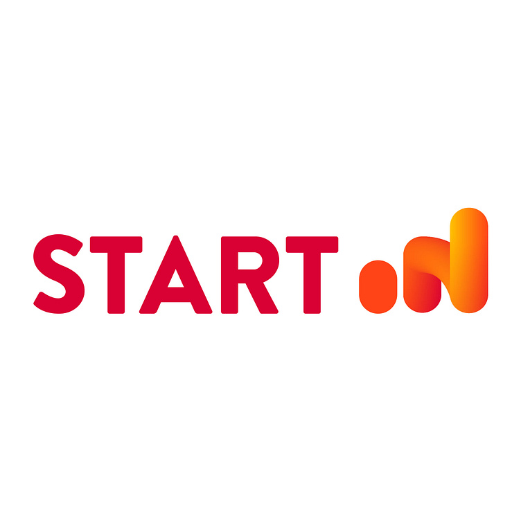
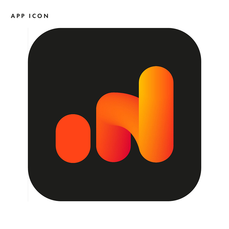
Logo design for new company Start In. They are the first app based incubator for the startup community. The final logo shows communication - using the three bars to show a strengthening digital signal as well as a growing momentum. Paired with a solid bold typeface which balances the circular forms of the icon with more structured hard elements. Alone the icon is bold and the gradient highlights the movement of the bars as well as saying ’IN’.
Find full case study here.
