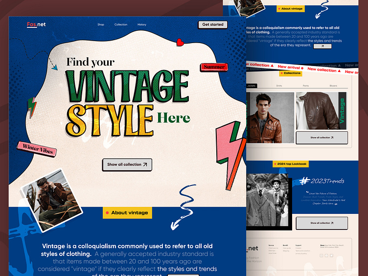
Vintage website Concept
"Vintage website Concept"
Embarking on the journey of creating a vintage clothing website through Figma was a delightful challenge. Infusing the design with authentic vintage vibes required a delicate balance of typography, color, and layout. I artfully curated a palette that echoed the charm of yesteryears, selecting warm and muted tones. Typography became a crucial storyteller, with carefully chosen fonts evoking nostalgia. The layout's meticulous detailing ensured the seamless integration of vintage elements, creating an immersive journey through time. Crafting a digital space where every pixel exudes the essence of vintage aesthetics was a rewarding triumph, encapsulating the allure of bygone eras in a modern web experience.
If you want a Free file or any project in mind-
Read and watch the UX case studies.
All social activities-

