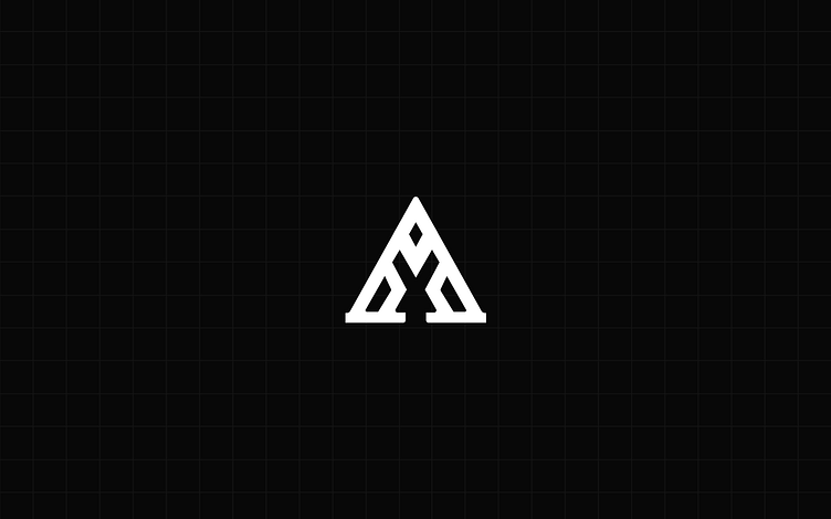
'A' + Greek mythology


The boldness of the 'A' in the logo communicates strength and confidence, projecting a sense of authority that aligns with the company's stature. On the other hand, the centrality of the 'X' adds an element of balance and stability, signifying the company's firm foundation.
The intentional widening of the foundation in the letter mark holds significant symbolic meaning. This design element, reminiscent of the base of a Greek column, serves as a powerful metaphor that adds another layer of depth to the logo's narrative.
In classical Greek architecture, the column was a fundamental structural element used to support buildings such as temples. The base of the column, known as the stylobate, provided a stable foundation upon which the entire structure rested. By incorporating a similar widening at the bottom of the letter mark, the logo visually echoes the concept of a solid and dependable foundation.
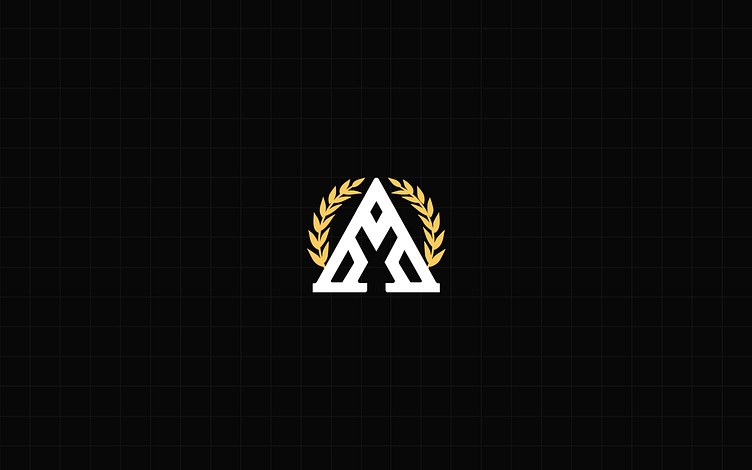
The choice of a bold sans-serif style for this logo was used as it serves to bridge the gap between classic and contemporary design techniques. Sans-serif fonts are known for their clean and minimalist aesthetics, which are often associated with modern design trends.
The mention of the sans-serif style in Greek typography is a fascinating touch. Sans-serif fonts are indeed commonly used in contemporary design, and their utilization in Greek typography further accentuates the synergy between tradition and modernity. This choice not only reflects a harmonious blend of different eras but also suggests that even as times change, certain design elements can stand the test of time.