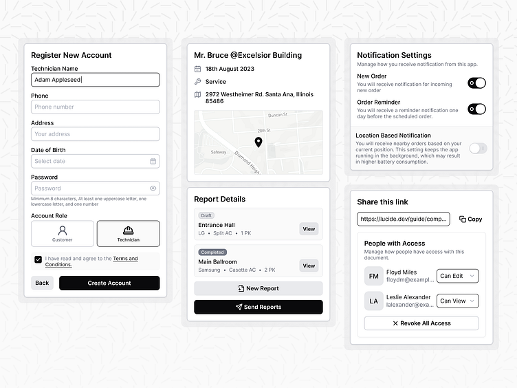
Monochromatic UI Component
This monochromatic UI Component shows that it is possible to make the entire component only using grays. The challenging part is to choose which part of gray shade is used to accommodate component variants (such as hover and on pressed). From this I learn that if you have a good gray palette then you will likely have a good UI.
More by Falah Filano View profile
Like
