Error Page
What could possibly be simpler than an Error Page?
However, there are certain guidelines and recommendations to follow.
I've included some useful links that will assist you in creating an effective and user-friendly Error Page.
6 best practices for 404 pages with killer UX:
"A lot of sites used to fall into the trap of “Panic! The user got a 404! Let’s show them everything we got and see if they bite” Bad idea. Overwhelming the user with a 404 page jam-packed with links to every nook and cranny of your site is a surefire way to cognitively overload an already frustrated user. And as NN Group guru Kathryn Whitenton makes clear, cognitive overload and usability do not go hand in hand.".
Improving the Dreaded 404 Error Message
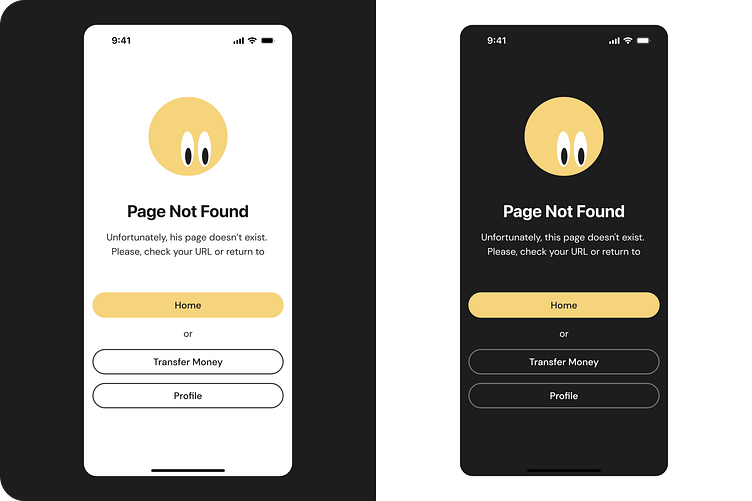
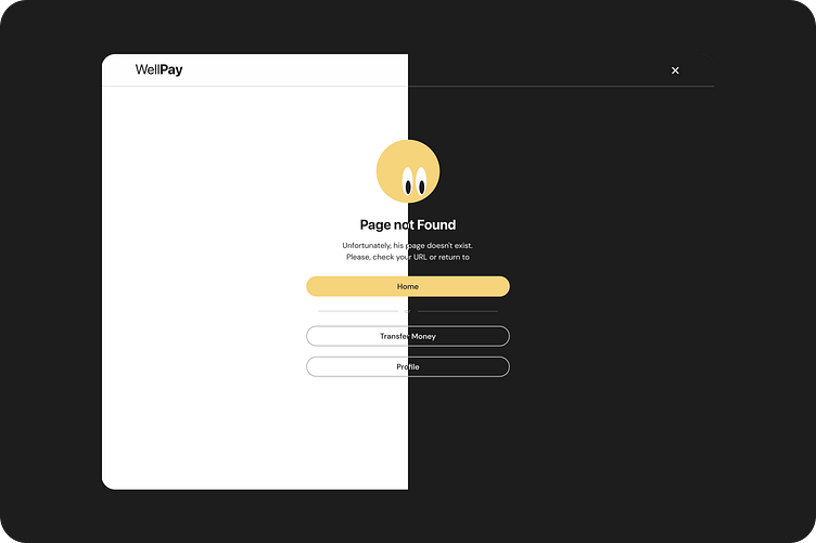
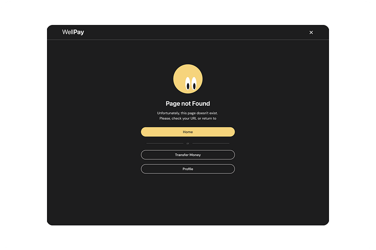
"This error message violates the three basic guidelines for error messages. All error messages must be:
written in plain language that is easy to understand for non-technical users and that does not imply that the mistake is the user's fault
precise in specifying exactly what was done wrong (that is, not be generic or vague)
constructive in suggesting steps the user can take to correct the problem".
