Nothing website redesign

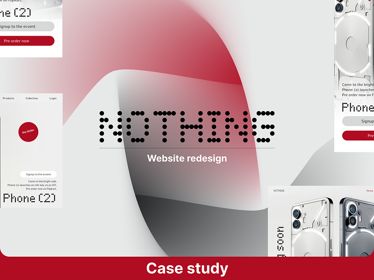
Basically, I love to redesign everything if I see any product, and if I feel I can improve it in any way, I will redesign it so. Just like that I redesigned nothing website.
Nothing is one of my favorite companies because of their unique design language and their current website is unique but not unique enough when you compare it to Nothing products there are a lot of spaces that can be more interesting on that website so I redesigned and created small case study explaining the changes I made hope you guys like it and I would love to hear your reviews.
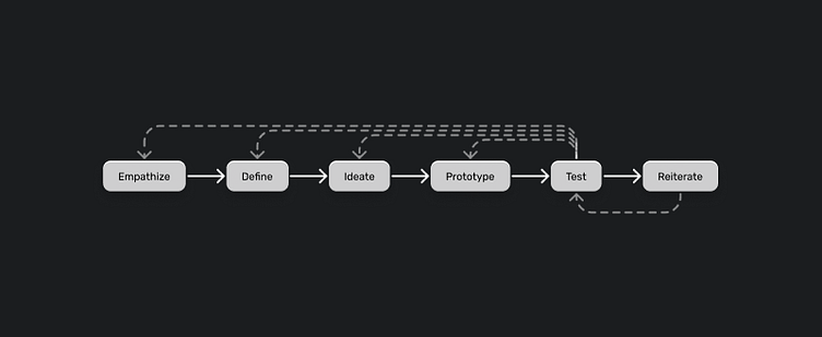
My Process
I do not follow any fixed process my process varies from project to project
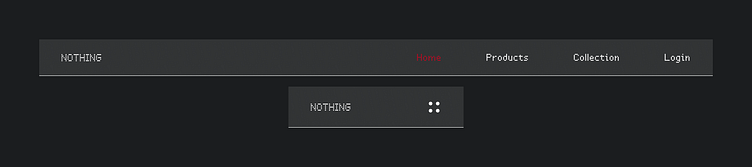
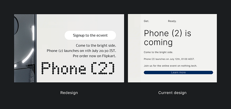
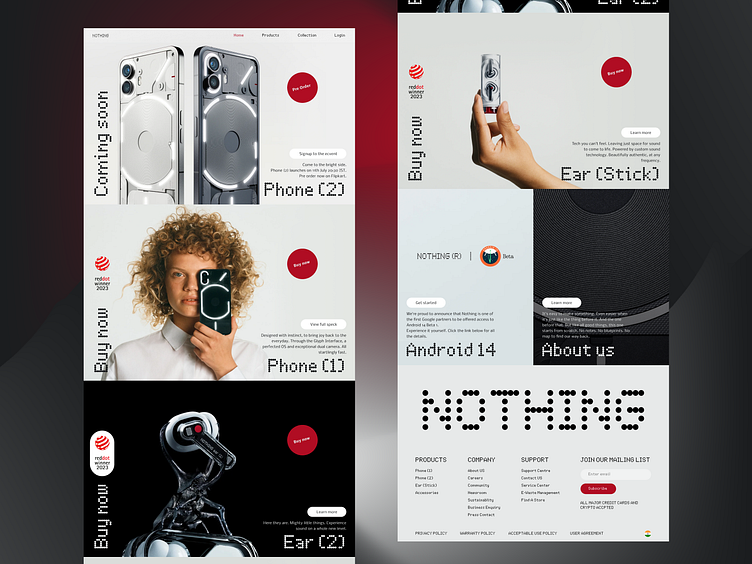
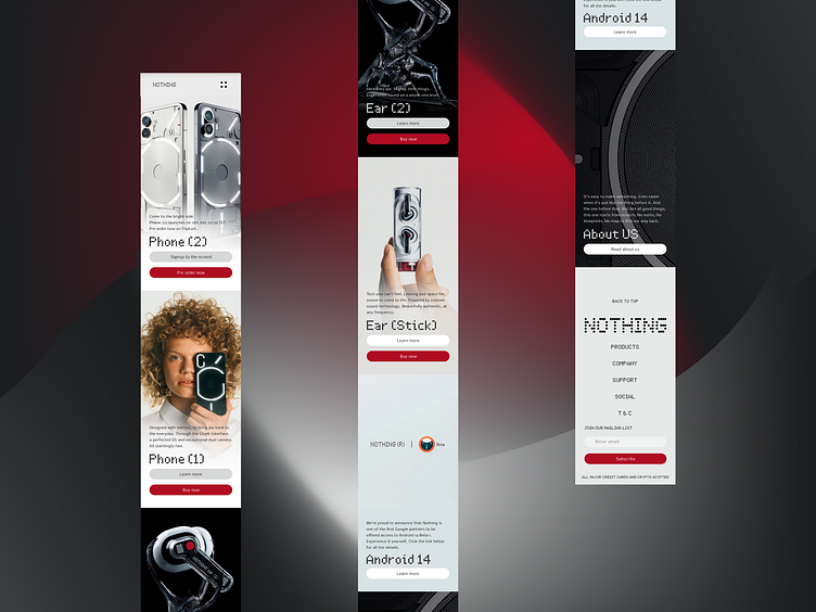
Final design in case you are in hurry
Lets start
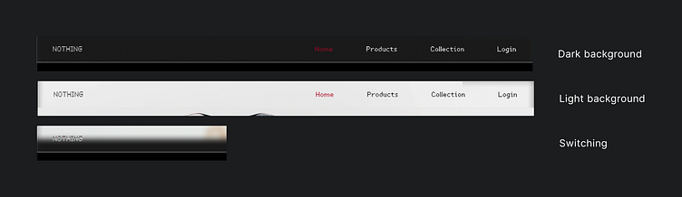
1. Nav bar
Replaced the solid background with 10% of wight and by ay adding background blur to get a glassmorphism look instead of using the normal hamburger icon I replaced it with nothing dots
Problem
White logo and white Navlinks is creating accessibility issue on light background since the Navbar background is not a solid color and switching Navlink to black also creates the same issue on black backgrounds.
Solution
Changing the blend mode of the text and logo to Overlay automatically changes the color based on the background color if the background is black text will be white and vice versa.
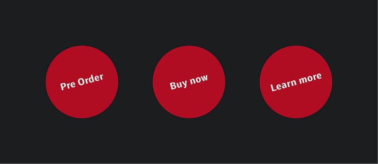
2. Cursor
I replaced the boring arrow with the red circle and it acts as both the cursor and Primary CTA
So instead of user navigating toward the CTA, the CTA button will follow user
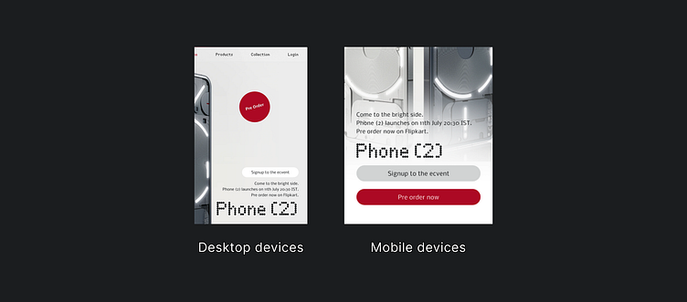
Problems 1
There will be no cursors in touch input devices
Solution
By adding a CTA button that is only visible in touch input devices or devices with smaller screens
Problem 2
Cursor may be confusing if the user visiting the website for first time.
Solution
By adding an extra button that performs same function users can use that if it's confusing.
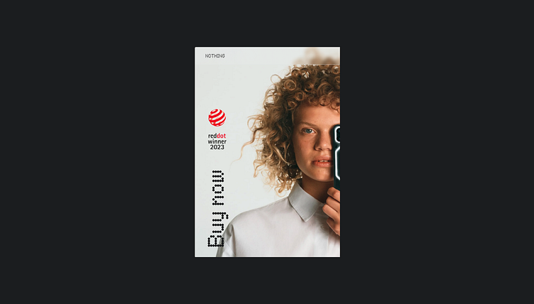
3. Product details
Final website
Thanks
Let me know your thoughts in comment 😁