Sports and Gaming App - Web Landing Page


Hey There🙂
PlayerzPot, India ka Naya Maidan is one of the fastest-growing Fantasy Sports & Casual Gaming apps in India and has already become one of the top names in this sector. With more than 1.5 Crore+ Trusted Users and winnings of up to 10 Crore daily, you have the opportunity to become a real master of skill-based games while experiencing a seamless gaming experience.
At PlayerzPot you get to play Fantasy Cricket and Fantasy Football combined with thrilling games such as Ludo, SLL, Rummy and Carrom. Additionally, you can dive into playing casual games like Fruit Slice, Chain Reaction, Quiz Games, Stacky Bird, Sheep Fight, AntMan, and more.
Ever since its inception in 2015, PlayerzPot has gone on to become one of the popular Fantasy gaming platforms for Indians. The fact that we not only focus on Fantasy Sports but also on Gaming that has given this app an edge over the competition in several different ways. By 2023, we will be adding 50+ casual games to our platform. And by 2022, we already have more than 1.5 Crore+ Trusted Users on our platform.
To know more, click on the below Link
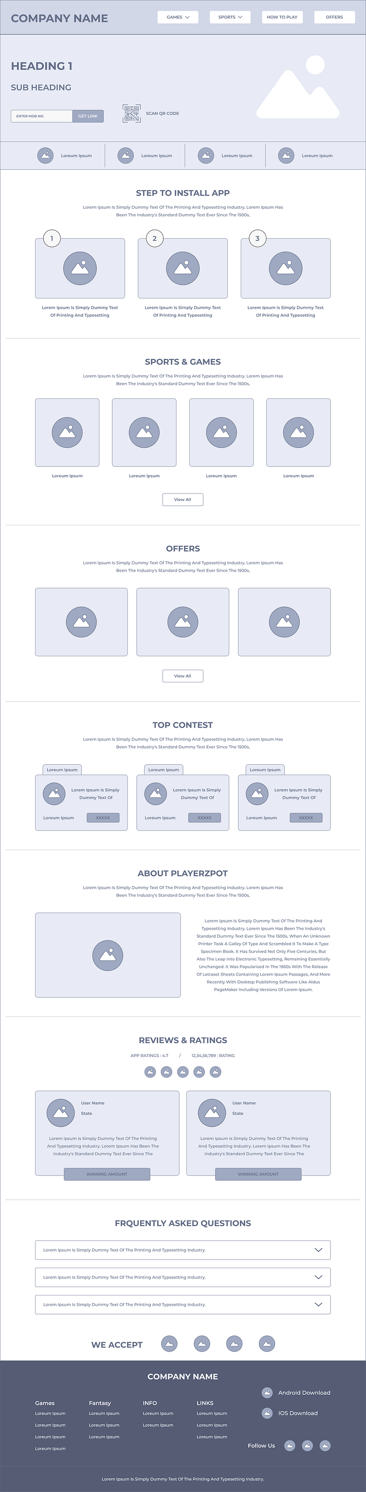
Wireframe✏️✍️
Wireframing is a crucial step in the design process. It act as a blueprint for the design, focusing on the layout, structure, and functionality without getting into specific visual details like colors, icons and images.
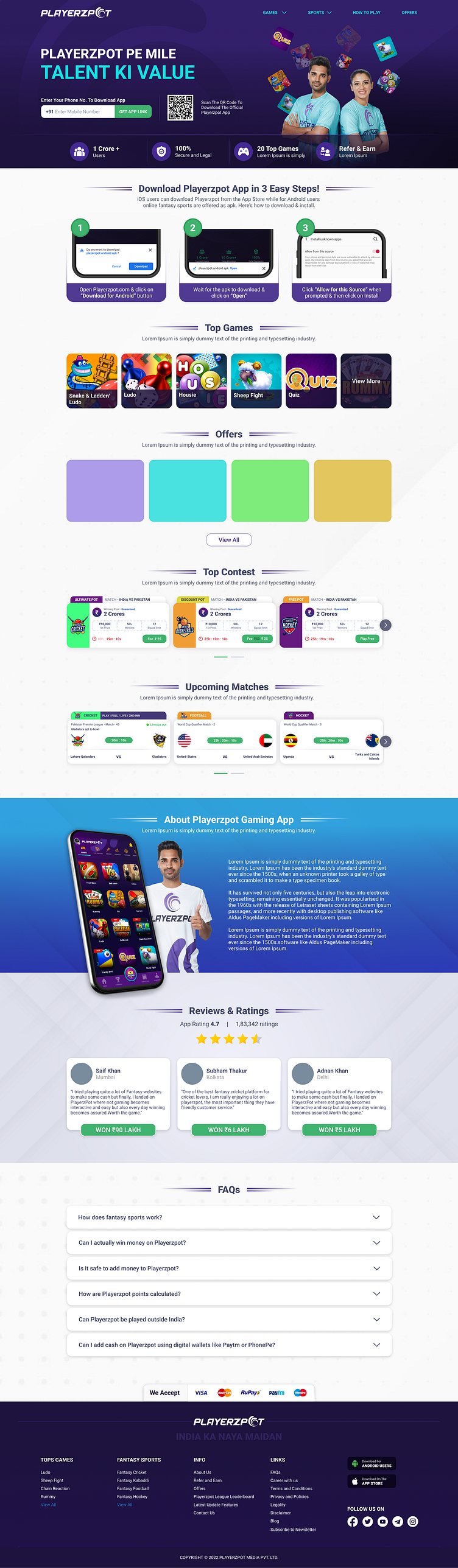
High Fidelity🖥️
Once we were ready with the wireframes, we converted them to high fidelity that includes a detailed and polished representation of a user interface. In a high-fidelity design we included precise visual elements, realistic interactions, and accurate content. We ensured that these designs offers a more immersive user experience, facilitate usability testing and collaboration, and provide a solid foundation for the development phase.
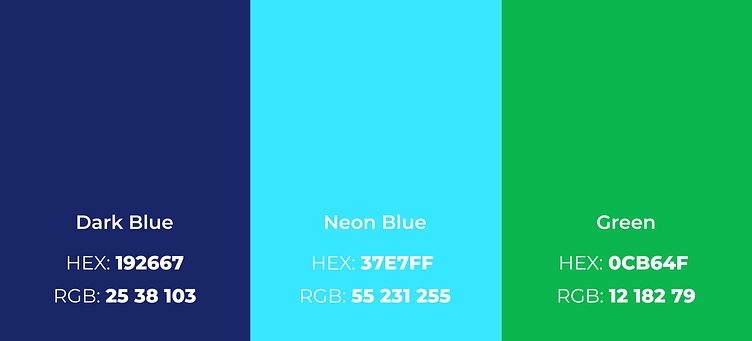
Colors🎨
Choosing the right color for the platform or brand is very important to standout from others. By using colors strategically, we can create a positive impact on the users. We created a color palette that consists of a set of colors that are carefully chosen and used consistently throughout our app interface. We came up with a well-thought-out color palette that makes this platform visually appealing, cohesive, and user-friendly.
Font 🔠🔡
‘Roboto’ the font typeface that is entirely designed at Google which is easily available and comfortable for reading to the users.

Thank You For Visiting😊
Have a good project? Let's get connected
Email ID: [email protected]
OR
Contact Through: