ParentPay Desktop Visual Case Study

ParentPay Desktop Visual Case Study
ParentPay.com is an online payment service for schools that facilitates payments and communication between parents and schools in the UK. While it has been serving its purpose effectively, the website's outdated design and user experience have become a concern.
This case study outlines the process of redesigning ParentPay.com to enhance its Interface (UI) and experience (UX), Ultimately improving user satisfaction and engagement.
Research and Analysis:
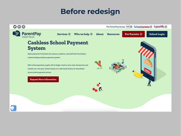
A thorough evaluation of the present website's UI was done to start the redesign process. Several key issues were identified:
UI Issues:
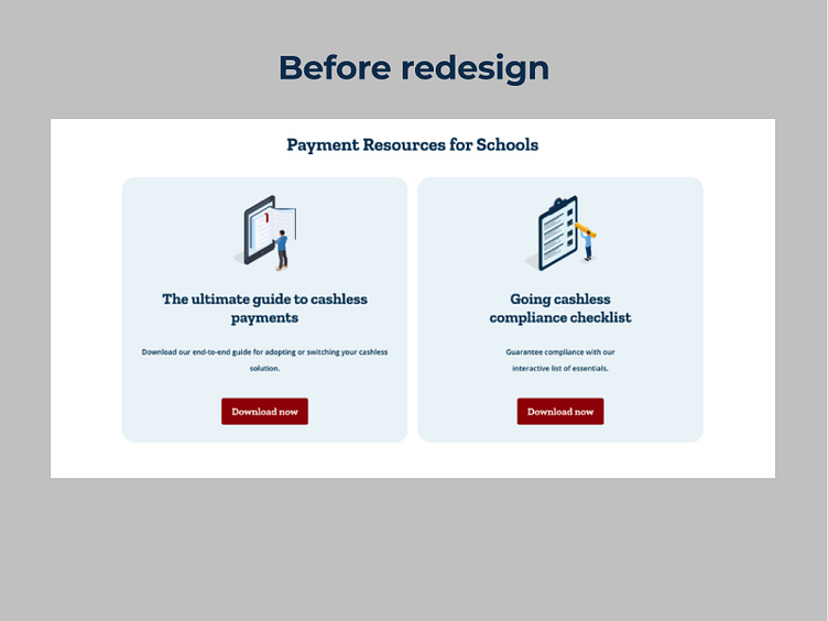
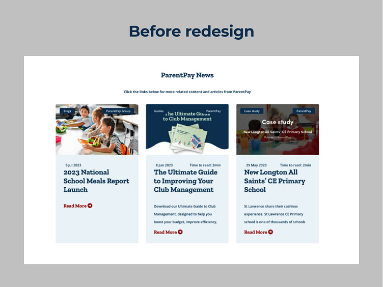
1. Outdated graphic style with illogical font and colour choices
Visual structure is absent and the layout is cluttered
Elements and button positions that are inconsistent
A shortage of white space and poorly formatted text
Goal:
The main objective of the redesign is to produce a contemporary, user-friendly, and visually appealing website that improves the overall user experience. The following specific goals: For all users, make the website more accessible.
For parents and schools: Simplify the payment process.
Improve platform usage and user engagement. a modern visual identity might help to improve brand perception.
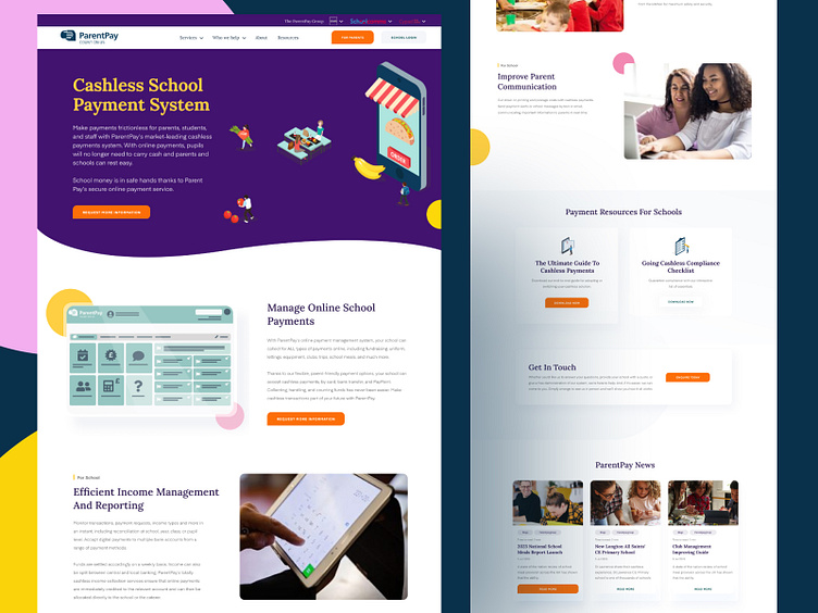
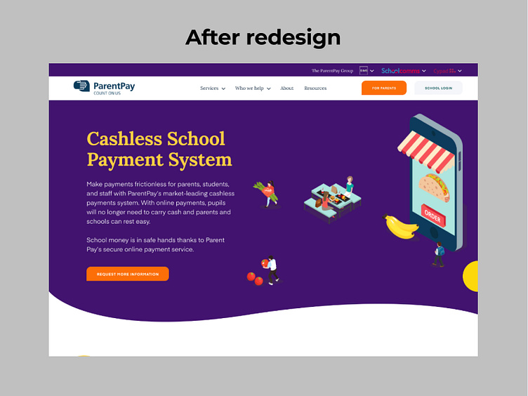
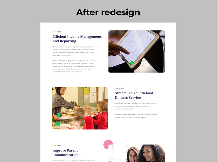
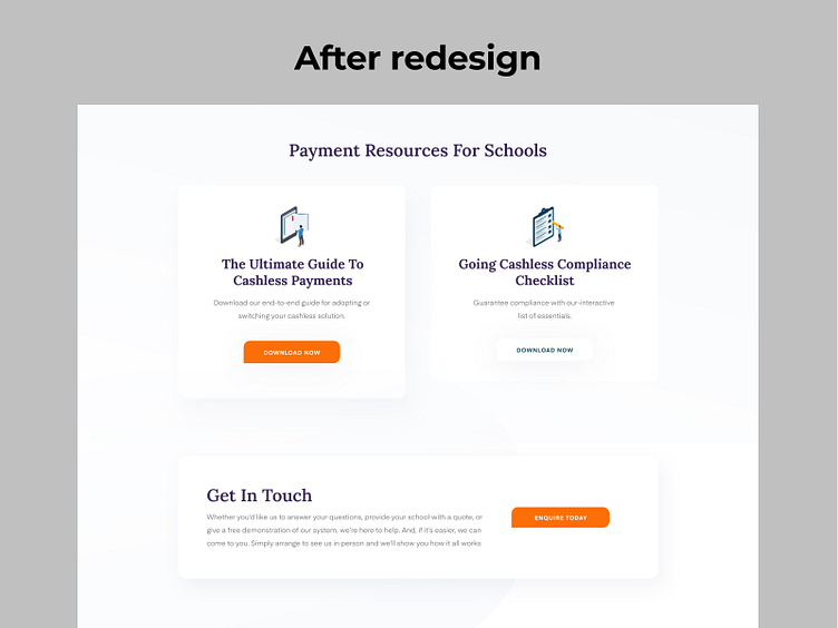
Visual Design:
A modern colour scheme that prioritises readability. We will choose contemporary, readable typefaces to enhance the display of the material.
The layout will be updated to provide a better visual hierarchy and organisational structure.
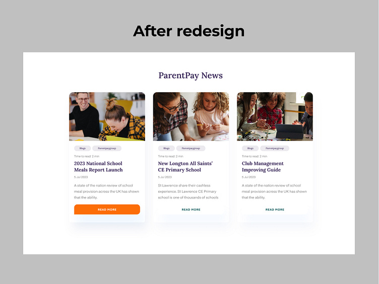
In conclusion,
ParentPay.com's new visual design considerably raises customer satisfaction levels overall and improves the user experience. The redesign makes sure that parents and school administrators can effectively navigate the platform, perform tasks effortlessly, and establish a positive perception of the brand. Enter your text here...