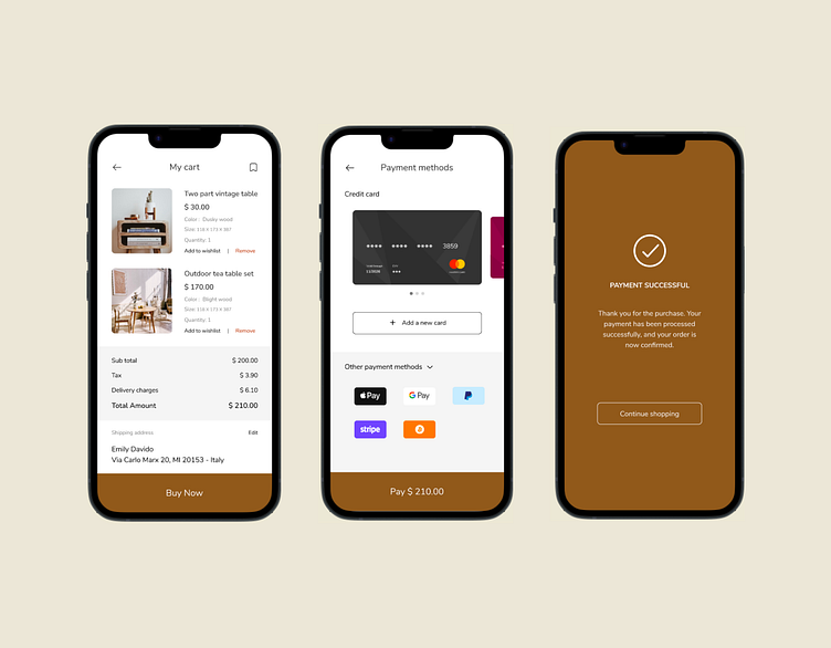
Daily UI Challenge 002 - Credit card checkout
💡 I began by designing credit card checkout screens for a furniture-selling mobile application, starting with the cart showing details of the items. As users proceed to the credit card checkout, the total amount is broken down, ensuring transparency by displaying charges upfront. On the payment screen, users can view their added credits, effortlessly add new cards, or use alternative payment methods. The intuitive button allows users to confirm the exact amount they will pay right on the same page, eliminating the need for unnecessary steps. Finally, a payment success screen provides the user with a reassuring sense of completion.
More by Gudiya Sathyalal View profile
Like
