Letter Logo | MV | Mountain| Branding
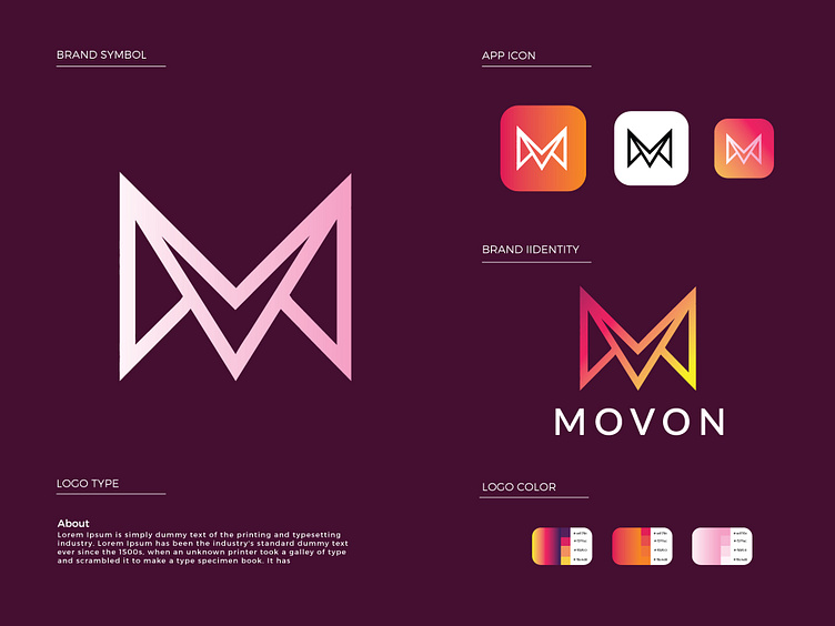
The MV wordmark logo beautifully integrates the majesty of mountains into a captivating design. The logo features the initials "M" and "V" intricately crafted to form a stylized mountain shape. The "M" and "V" are seamlessly merged, symbolizing unity and synergy, reflecting the brand's commitment to collaboration and growth.
The mountain shape represents strength, ambition, and resilience, embodying the brand's determination to overcome challenges and reach new heights. The clean and modern typography of the wordmark complements the mountain design, conveying professionalism and clarity.
The color palette chosen for the logo may include earthy tones, such as shades of green and brown, to represent nature and the outdoors. Alternatively, bold and vibrant colors may be used to evoke a sense of energy and dynamism.
Overall, the MV wordmark logo is a powerful representation of the brand's identity. It communicates the company's aspiration to conquer new challenges while staying grounded in its values and commitment to excellence. The design evokes a sense of adventure and ambition, making it an ideal logo for a brand that values growth, collaboration, and the spirit of exploration.
I would love to hear your feedback on this design. Let me know your thoughts about this logo in the comments.
Don't forget to Press 🧡 if you like it!
This logo is unused. Available for sale
(Unused Concepts)
Get in touch with me:
Regards
