Idea::Bank


Idea::Bank strategic facelift
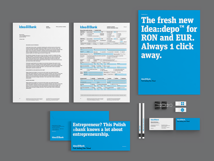
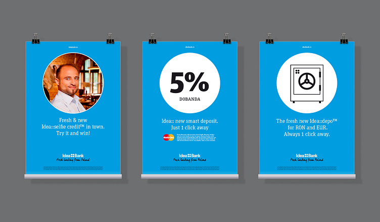
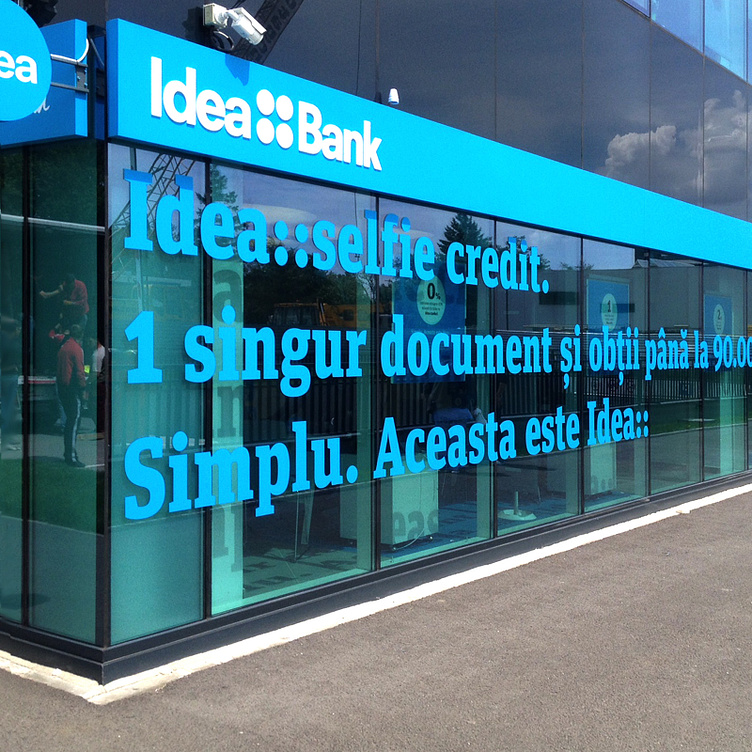
The original identity has undergone a subtle facelift, with the purpose of sustaining a cohesive brand architecture and of enhancing the role of the “Four Dots” symbol. Consequently, the symbol was given an unusual but very important function, clarifying the masterbrand architecture and inviting a flexible but always branded product development. Furthermore, the symbol acquired additional internal and external communication meaning, as well as the functional ability to recreate the brand or product visual identity in headlines and body text, either as a double colon or personalised hashtag.


Client
Idea::Bank
Year
2015
Services
Design for publishing
Recognition
Costa Rican design website “El Poder de las Ideas” acknowledges Brandient’s facelift for Idea Bank’s logo among the worldwide landmark design works for the financial industry in 2015.
Books & Magazines
Graphic Design School: The Principles and Practice of Graphic Design, 6th Edition — Wiley Publishing, 2016
Credits
Agency: Brandient
Design Director: Ciprian Badalan
I designed this items while being part of Brandient team. Brandient, with offices in Bucharest and Singapore, is a brand strategy & design consultancy inducted into Rebrand Hall of Fame for Branding Excellence Worldwide.
Thanks for viewing!
Get in touch [email protected]
Let's connect instagram & behance
More about me on ciprianbadalan.com
Copyright © Brandient
Copyright © Ciprian Bădălan
—
All rights reserved.
None of these images can be reproduced in any form without written permission from its author. All trademarks belong to their respective owners.