Logo for Tabelware Brand

Lonire: Crafting Identity for Portugal's Modern Tableware
In the picturesque streets of Portugal, Lonire emerged as a haven for tableware enthusiasts, specializing in exquisitely crafted and fashionable ceramics. To embark on its journey, Lonire needed a logo that would not just reflect its contemporary approach but also mirror its dedication to ceramic creations.
The Vision
Our creative journey began with a deep dive into the soul of Lonire. We aimed to understand what set this tableware store apart: its fusion of modern aesthetics with the age-old tradition of ceramic craftsmanship.
Design Case
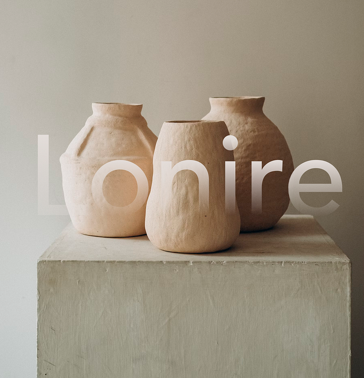
At the core of Lonire's identity is its commitment to the art of ceramic making, and we wanted to capture this essence in the logo. We envisioned a design harmoniously blending modernity and timelessness, just like Lonire's product offerings.
The choice of a calming and earthy color palette mirrors the natural elements used in crafting Lonire's ceramic pieces. It evokes a sense of warmth, inviting customers to explore the store's offerings with the promise of finding not just tableware but pieces of art that enhance their daily rituals.
The Impact
Lonire is a place where craftsmanship meets modern living. Customers understood that the tableware offered by Lonire was not just about functionality but also about elevating the dining experience to an art form.
In Portugal's tableware landscape, Lonire's logo stands as a testament to the power of visual branding. It beckons customers to a world where every meal is a work of art and where each table setting tells a story. Lonire's logo isn't just a design; it's a gateway to a unique dining experience.