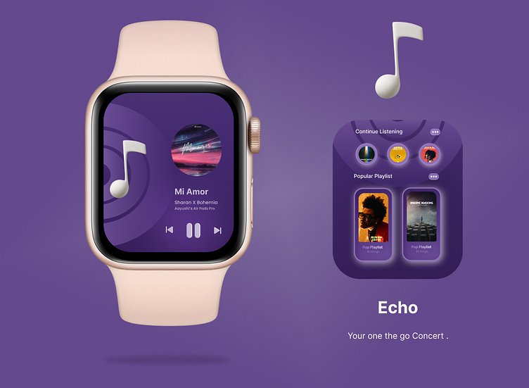
Echo - iWatch Version !
🎵🌟 My First UI Design for an iWatch Music Player App - Echo! 🎧⌚
I'm thrilled to share my debut iWatch UI design—a music player app that's a symphony of style and convenience, called Echo! 🎉
🔥 Embracing the challenge of crafting an interface for a compact device like the iWatch, Echo is a testament to seamless user experience and captivating design. With just a few taps on your wrist, you can immerse yourself in a world of melodies and rhythm.
🌈 Echo's intuitive interface makes music navigation a breeze, allowing you to effortlessly switch between tracks, control volume, and browse playlists. The sleek visuals and smooth interactions harmonize seamlessly with the iWatch's form, ensuring a delightful music experience on-the-go.
💥 As I took my first step into the world of iWatch UI design, I aimed to strike the perfect chord between aesthetics and functionality. Echo represents my passion for crafting user-centric designs that elevate everyday interactions.
🔍 Curious to witness my debut iWatch UI design in action? Head over to my profile to view the full image and embrace the melodies of Echo. Don't forget to leave your feedback—I'm eager to hear your thoughts on this musical journey!
🚀 Let's continue to fine-tune our skills and create more magic in UI design! Stay tuned for the next steps in my 100 Days UI Challenge, and let's inspire each other to create extraordinary experiences! 💪🎶
#UIUXDesign #iWatchUI #MusicPlayerApp #EchoTheme #DesignInspiration #UserExperience #GrooveWithEcho
