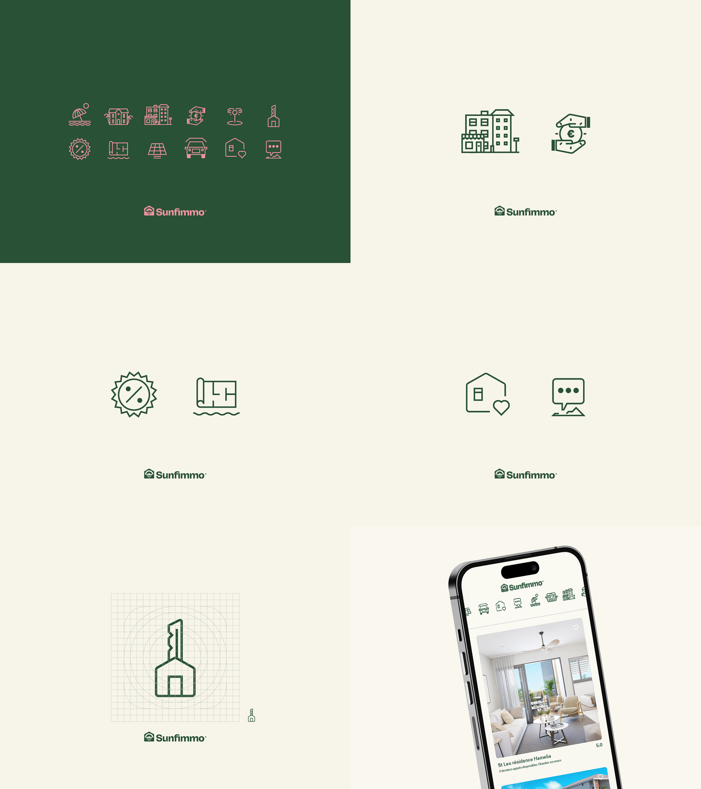
Sunfimmo: icon system
Located in the Mascarene Islands, Rèunion Island is a French overseas department that offers travelers a paradisiac tropical island in the Indian Ocean. A crossroads of African, Asian, and European civilizations, Rèunion is an exotic melting pot of cultures.
For many travelers, discovering Rèunion will make them want to stay there forever, thus coining our concept of turning the island into the paradisiacal home they had ever dreamed of.
The rebrand evolves to meet diverse customers and visitors all over the world. With Sunfimmo, we introduce a fresh new design system that maintains the core elements while keeping our customers’ experience focused on a luxury expression of a real estate agency with exclusive acquisition programs.
To achieve this, We thoughtfully incorporated a beautiful, expressive design system with calm confidence and clear visual communication by consistently utilizing the "Home Island" logo, with an expanded palette of greens and browns rooted in interacting with our symbolic icon and a constrained family of harmonious typefaces that brings purpose and cohesion to every interaction customers have with the brand.
