CRED Responsive Website Design


Web Design
https://s2464504.edinburgh.domains/index.html
I constructed the CRED website by manipulating and combining basic template elements from different sources, e.g., GetBootstrap, W3Schools, IDD (Introduction to Digital Design) course at the University of Edinburgh, and YouTube, meaning that I did not use a pre-made website template. Given the website format and layout on desktop and mobile, I tried to keep the amount of information and text compact and to the point. I should also note that I wrote the text from a perspective of an individual or team residing in Shanghai of the year 2146 as if all of it is real throughout the entirety of the website. This sort of approach, in a way, allowed me to expand on the main ideas and accentuate or even add depth to the narrative.
The CRED brand retains its significance throughout most of the designs. In the context of the website specifically, it seemed rather fitting to feature the logomark (aligned right on the desktop and centred on mobile) inside the customized Bootstrap NavBar and as a grey Favicon that works on all browser tabs. The addition of a text typing animation, with the help of a simple approach by Easy Tutorials on YouTube, helped me find a simple way of portraying technology against the natural landscape
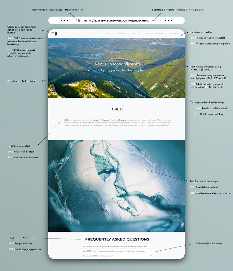
By implementing the "FAQ" area on the homepage, I could target potential questions regarding the CRED hybrid currency that would otherwise be out of place in the product or money form descriptions. This format allowed me to reference hypothetical relations with other nations, which adds to the believability and overall presentation.
It is vital to get the navigation bar properly functioning and looking, given that it features on all the following pages just as much as the CRED logomark. The simple approach by Haydn Adams (A Designer Who Codes) on YouTube to replace the default Bootstrap Hamburger Icon with a custom-animated one helped me to realize my design choices. Combined with the edited royalty-free stock images (under CC license), all visual and contextual elements fit right into place.
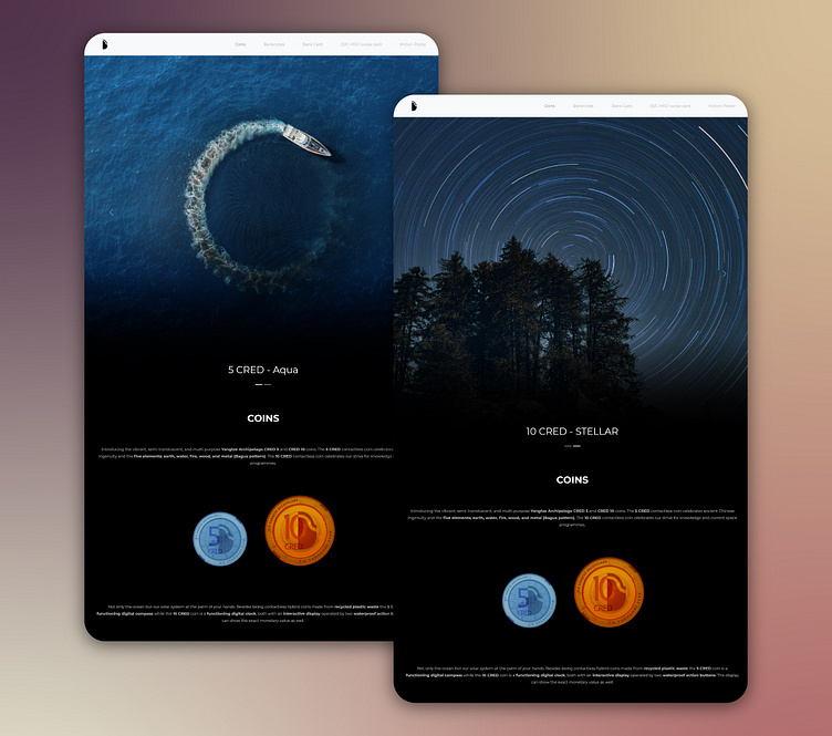
I made use of the basic flip card expression by adjusting the rotation axis to present the bank cards on their page. This helps differentiate the bank card from the ID/C-Mist Swipe Card and adds some interactivity.
